SDK Configuration
Learn how to configure the GlamAR SDK to match your development environment, use case, and platform.
General settings
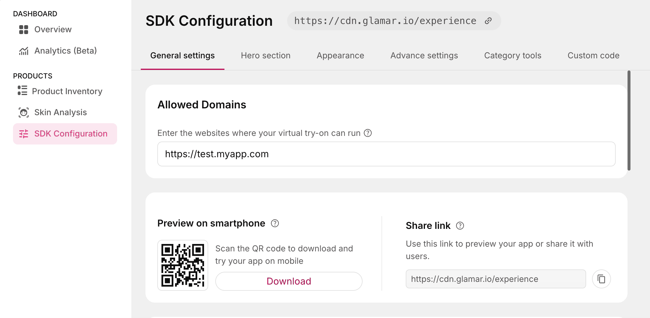
Allowed Domains
The Allowed Domains setting defines a list of trusted origins where the SDK is permitted to load and function. This acts as a security measure to prevent unauthorized usage of the SDK on unverified platforms. Only the origins listed here will be allowed to embed and interact with the GlamAR SDK. Any request from an unlisted origin will be blocked by default.
For Web Platforms
Enter one or more domain names where the SDK will be embedded.
- Enter full URLs (for example,
https://yourstore.com,https://test.myapp.com). - Separate multiple domains using commas (
,). - Wildcards (for example,
\*.example.com) are not supported unless explicitly mentioned.
Don't forget to add localhost if you're testing in a local development environment.
For Native Platforms (Android & iOS)
For native mobile applications, enter the app bundle identifier instead of a domain name.
- Android: Enter the application ID (for example,
com.yourcompany.yourapp). - iOS: Enter the bundle identifier (for example,
com.yourcompany.yourapp). - Separate multiple bundle identifiers using commas (
,).
You can find your bundle identifier in
build.gradle(Android) orInfo.plist/ Xcode project settings (iOS).
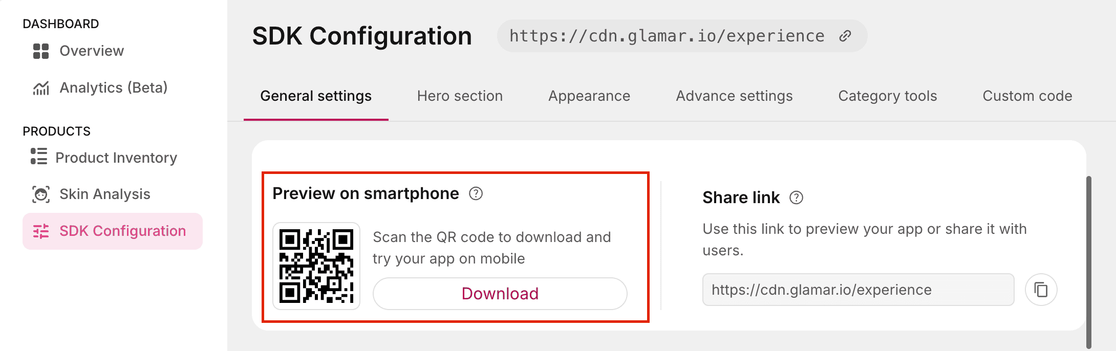
Preview on smartphone
This option provides a QR code that lets you preview how your app will appear on a mobile device.
Usage:
- Scan the QR code with your smartphone's camera to instantly open a live preview of the app.
- Click on the Download button to share the QR code with others or embed in your testing documentation.
Purpose:
This feature helps you quickly validate mobile layouts, UI responsiveness, and device-specific behavior without deploying the app publicly.
Share link
The Share link is a unique URL that allows you or other users to preview your app in a browser.
Usage:
- Open the link in your browser to test the app in a desktop or mobile view.
- Share the link with teammates, stakeholders, or testers for collaboration and feedback.
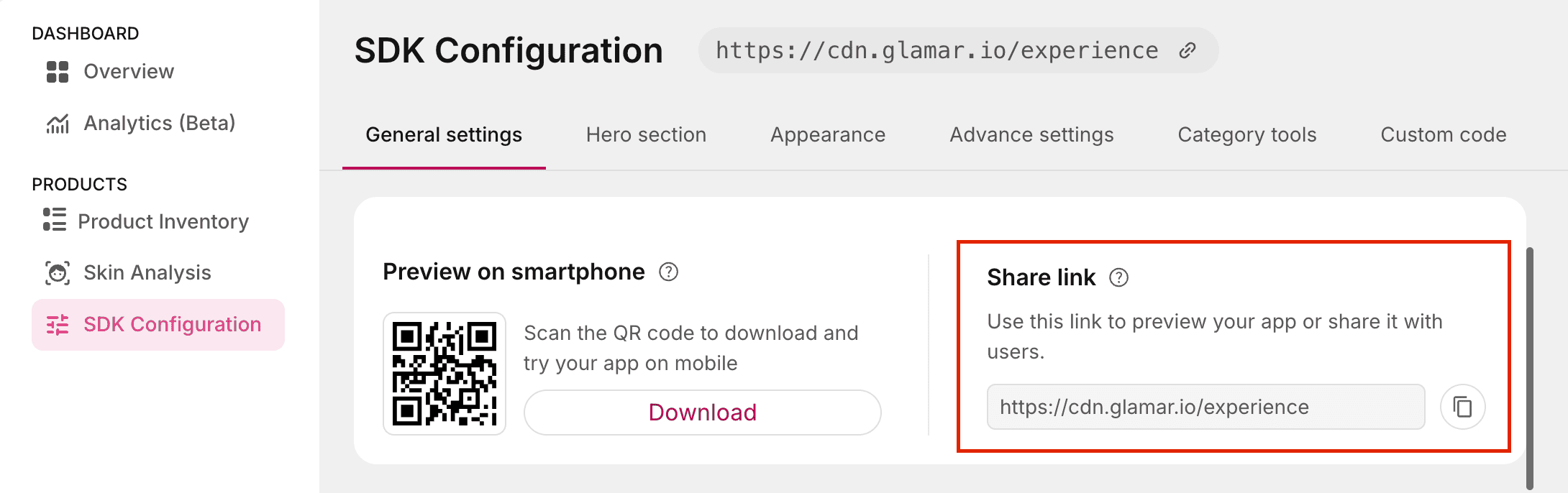
Purpose:
- Quick previews without installing the app.
- Cross-platform testing (for example, testing browser compatibility).
- Sharing work-in-progress builds with QA or design teams.
SDK version
You can switch to a different SDK version based on your project requirements. From the dropdown list, select the version you want to use and click the Update version button to apply the change.
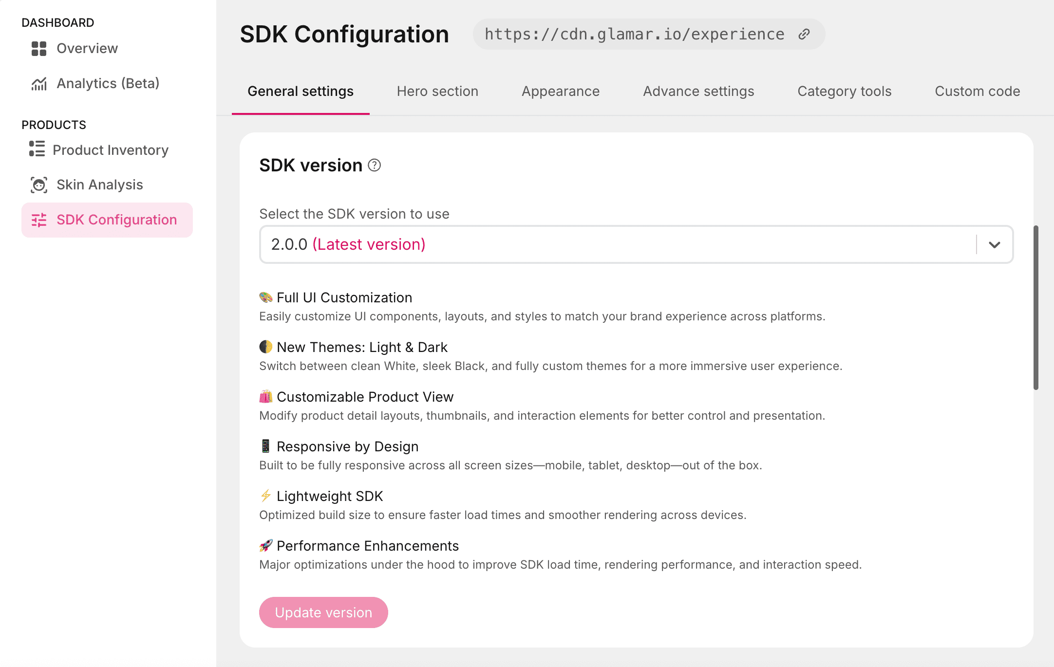
The latest available SDK version is 2.0.0.
Best practice:
- Always use the latest SDK version to benefit from the newest features, performance improvements, and security patches.
- Review the Release page before updating to understand any breaking changes or new capabilities.
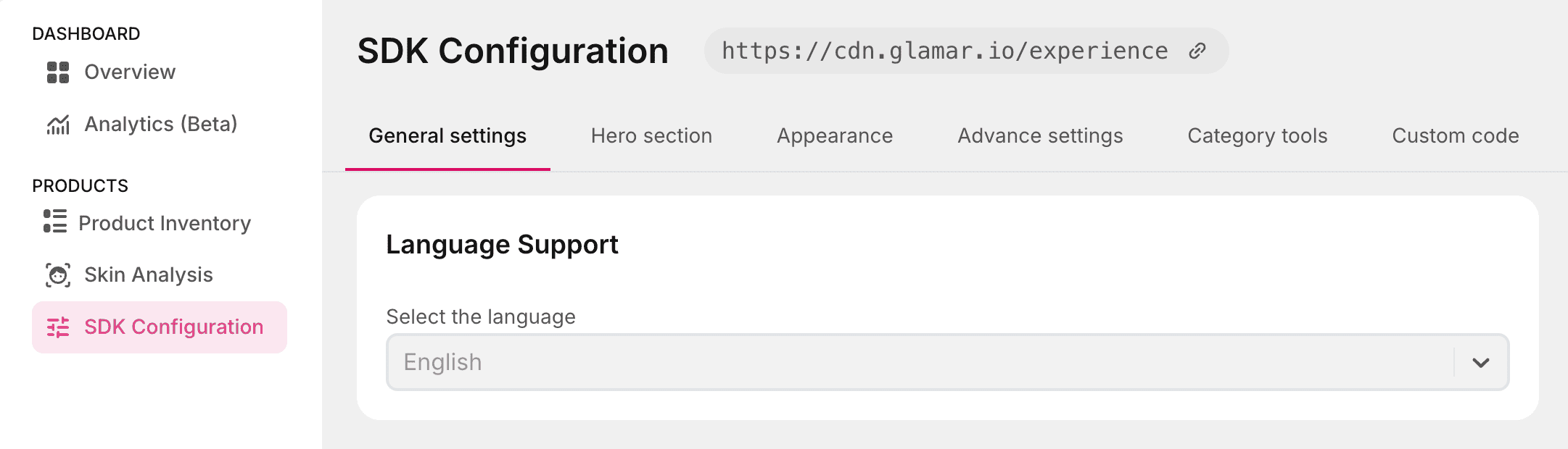
Language Support
The SDK currently supports English as the default and only available language. Future updates may include additional language options to enhance accessibility for a broader audience.
Try-on modes
Choose how you can experience products virtually:
- Live try-on: Uses the device's camera to overlay the selected product in real time, allowing you to see how it looks.
- Model try-on: Displays the product on a pre-selected human model image, allowing you to preview the item without using your device's camera.
In Model try-on, you can choose from three modes:
- Face Model: Displays the product on a human face image.
- Hand Model: Displays the product on a hand image.
- Finger Model: Displays the product on a finger image.
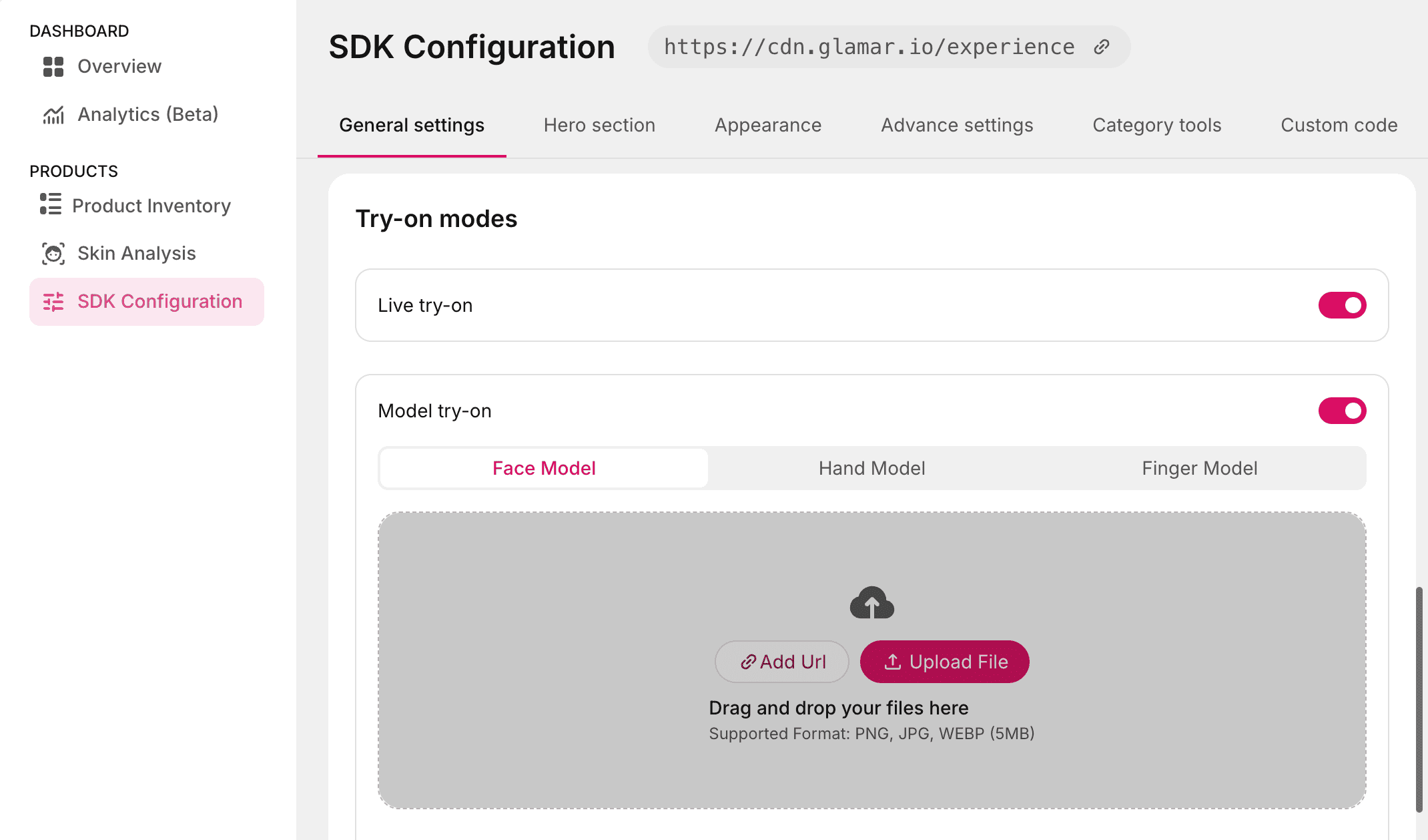
You can upload custom images for each mode, which will be shown during the product try-on experience.
Supported formats:
- PNG, JPG, WEBP
- Maximum file size: 5 MB per image
Use high-quality, well-lit images with a neutral background for the most realistic try-on results.
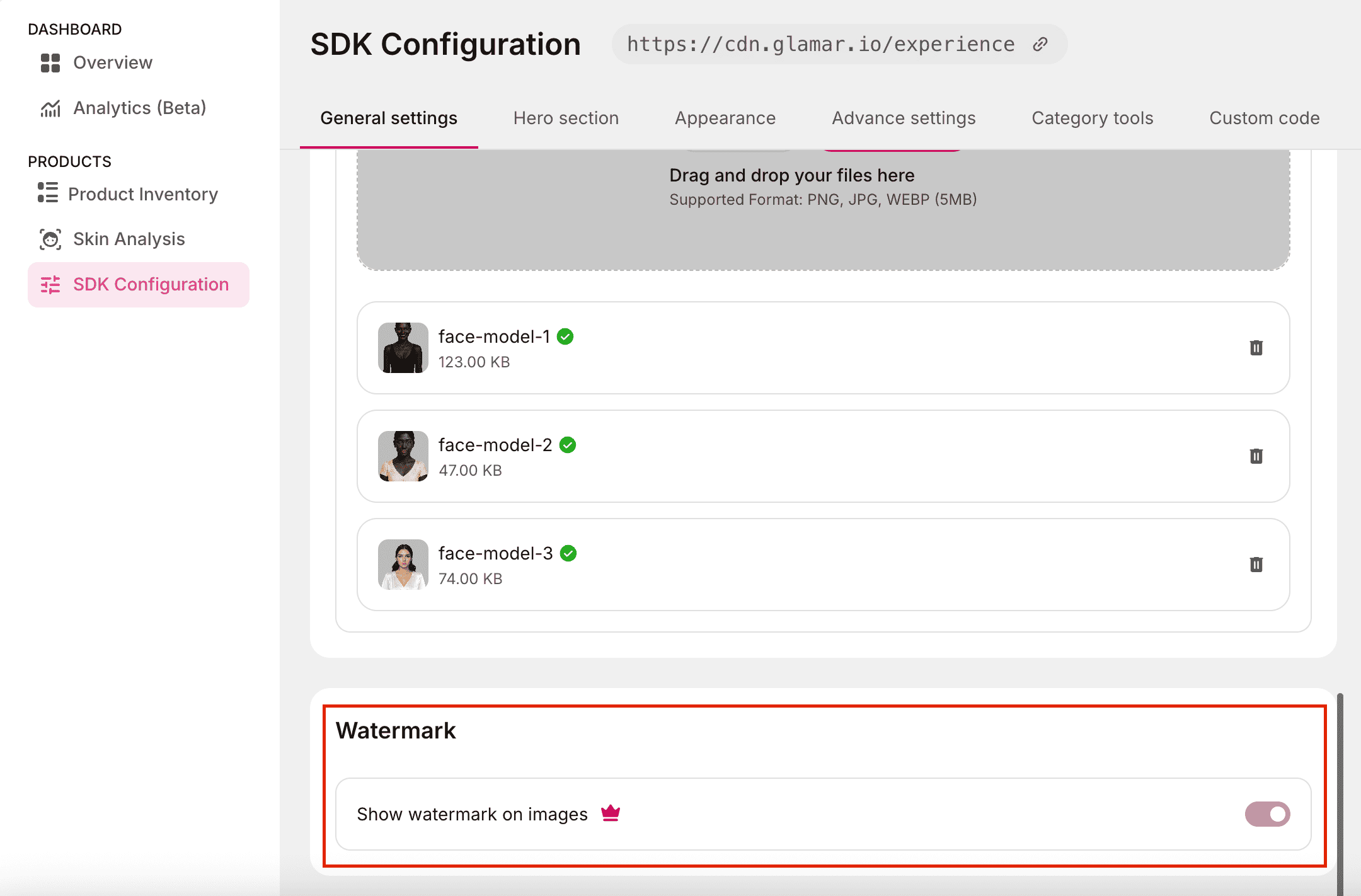
Watermark
Displays a "Powered by GlamAR" watermark at the bottom of the screen. Enabled by default, this watermark can be removed with a Premium Plan.
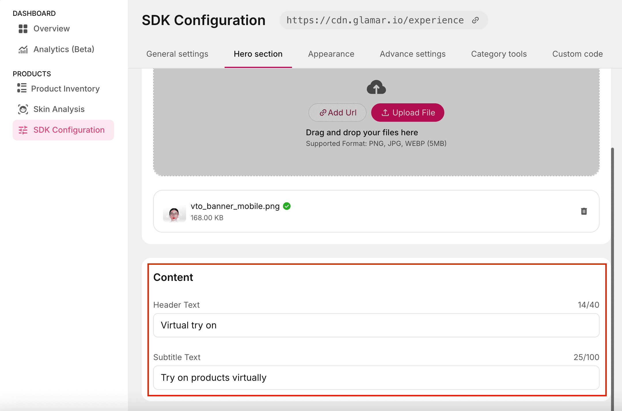
Hero section
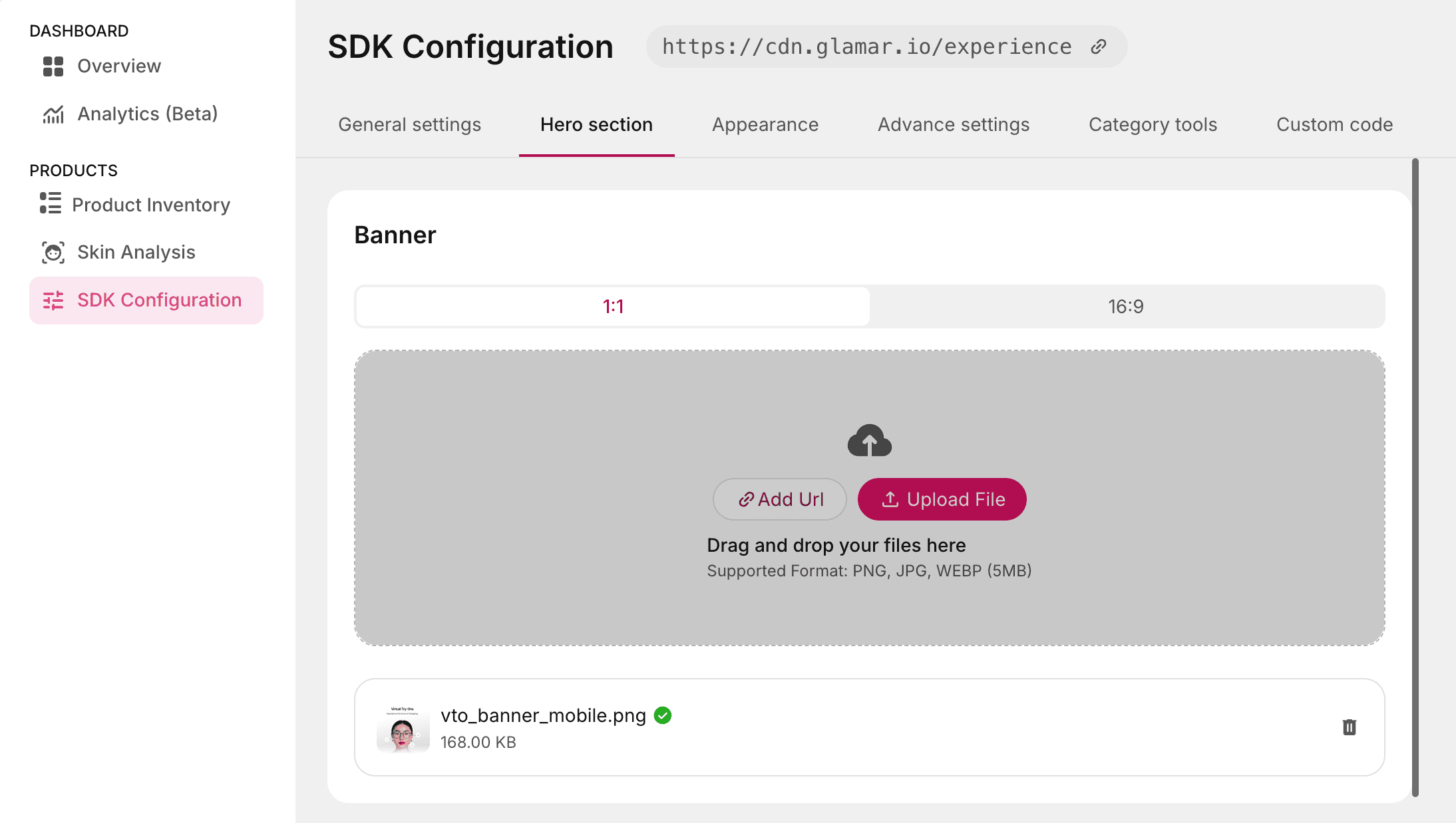
Banner
Allows you to customize the banner image displayed in the console window. You can replace the default banner with any image that aligns with your brand or personal preference.
Usage:
- Upload a new image file from one of the following methods:
- Add URL: Paste the direct link to the image.
- Upload file: Select an image from your device.
- Supported aspect ratios: 1:1 and 16:9.
- Supported formats: PNG, JPG, WEBM.
- Maximum file size: 5 MB.
Content
Allows you to customize the text content displayed on the console page. You can update two text elements:
- Header Text: The main title displayed at the top. (Maximum 40 characters)
- Subtitle Text: The supporting text displayed beneath the header, typically used for a short description or tagline. (Maximum 100 characters)
Appearance
Typography
Allows you to set a custom font for text displayed in the console window. Select your preferred font from the dropdown list. Currently supported fonts:
- Inter
- Poppins
- Roboto
- Open Sans
- Lato
- Montserrat

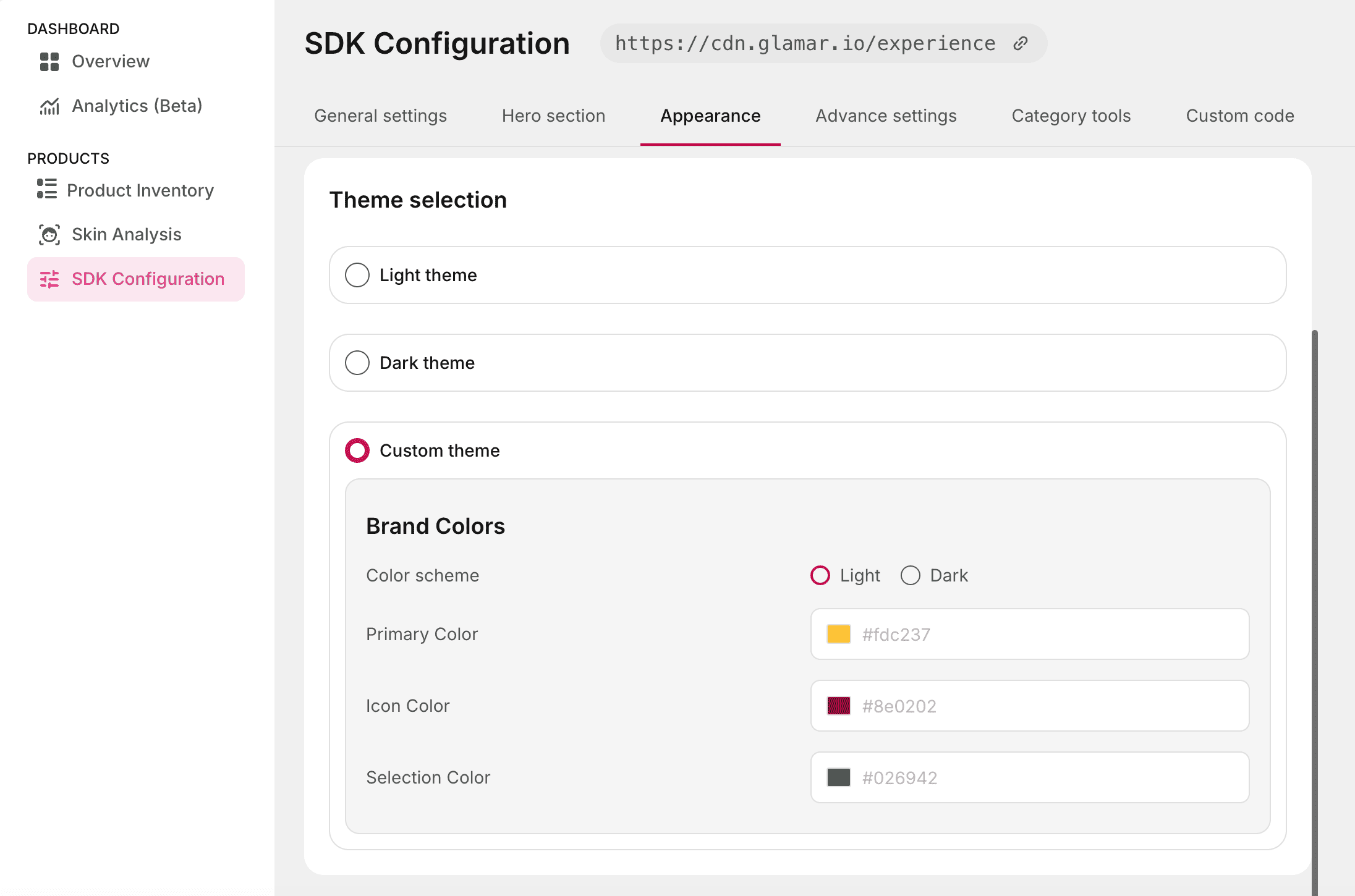
Theme selection
You can switch between built-in themes or create your own custom theme as per your choice.
- Light Theme: Clean and minimal white interface.
- Dark Theme: Sleek dark interface for immersive experiences.
- Custom Theme: Define a personalized color scheme, ensuring the SDK matches your brand’s identity. Available options include:
- Color scheme: Choose between Light or Dark as the base theme.
- Primary Color: Sets the main accent color used across UI elements.
- Icon Color: Defines the default color for icons in the interface.
- Selection Color: Specifies the highlight color used when elements are selected.
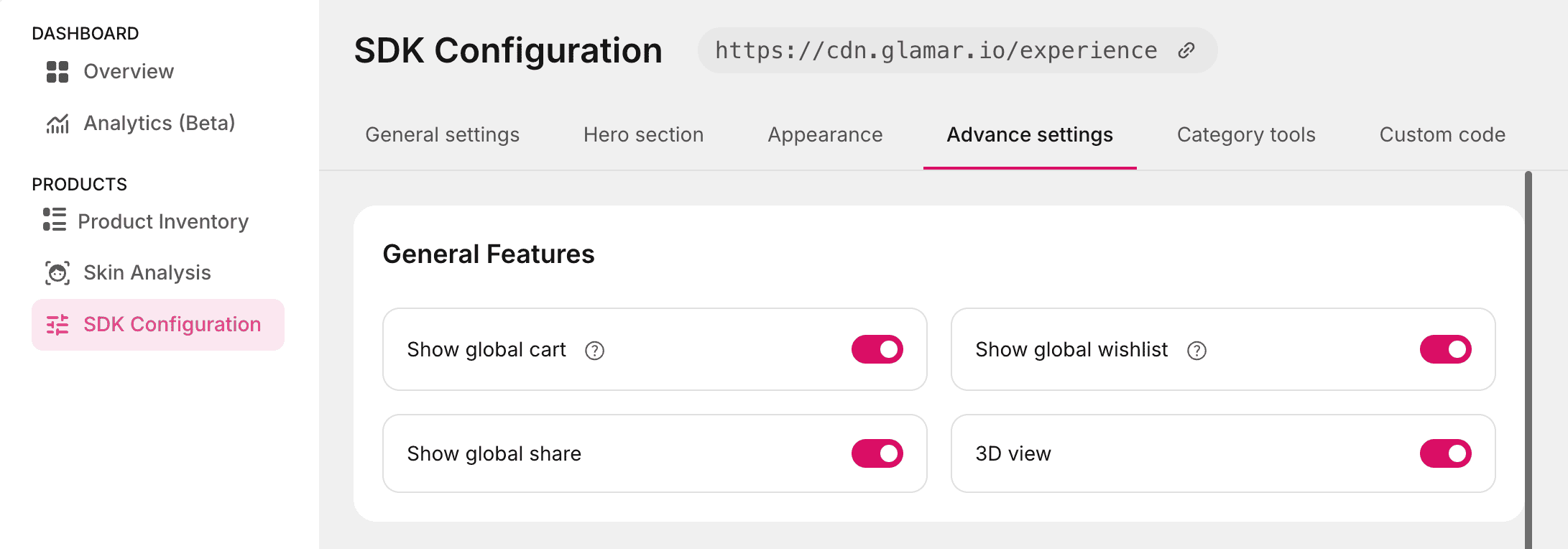
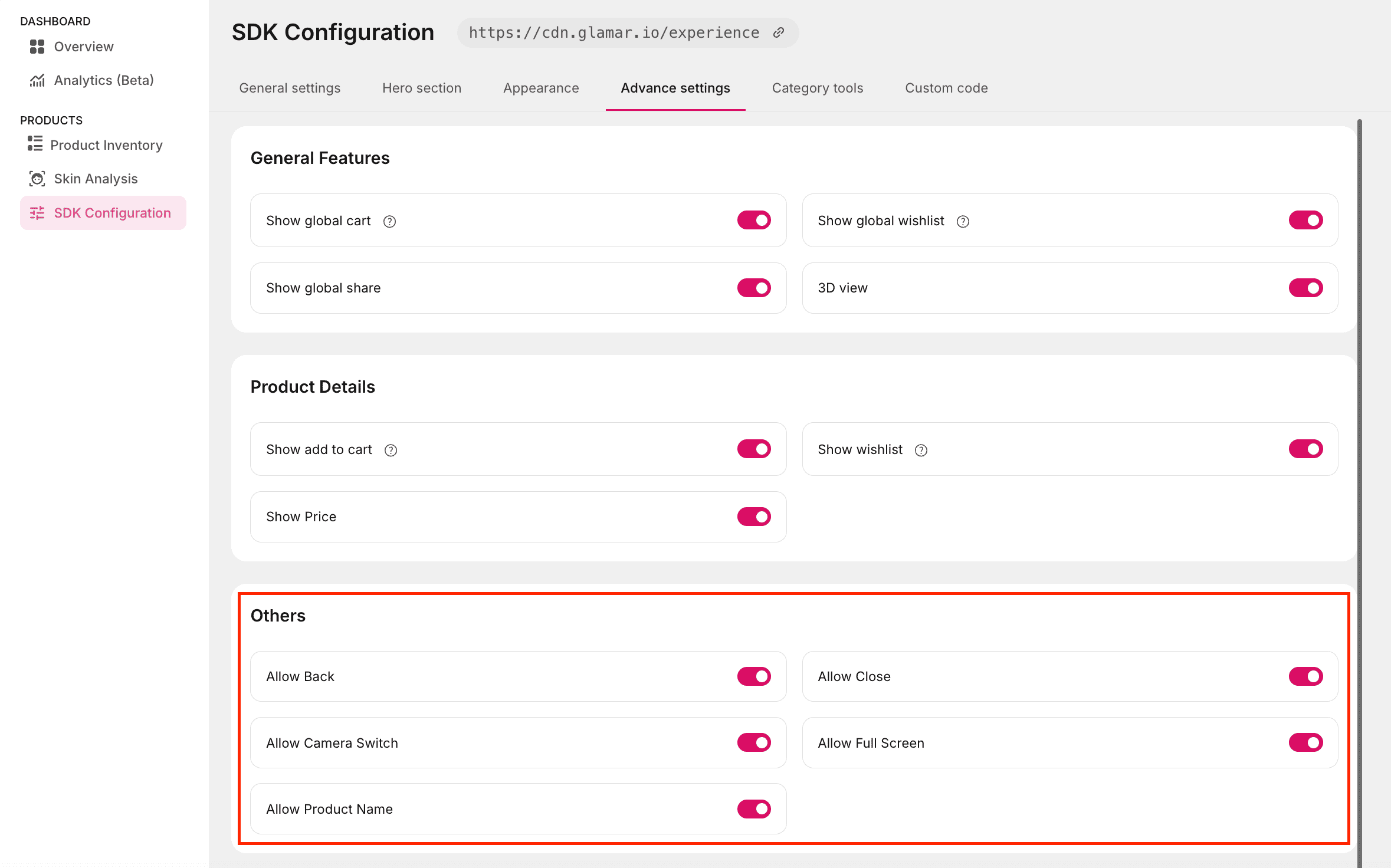
Advance settings
General Features
The General Features section allows you to toggle on or off several common options in the try-on window. The available options are:
- Show global cart: Display the global shopping cart button in the try-on window.
- Show global share: Display the global share option for quick content sharing.
- 3D view: Enable or disable the 3D product view button in the try-on window.
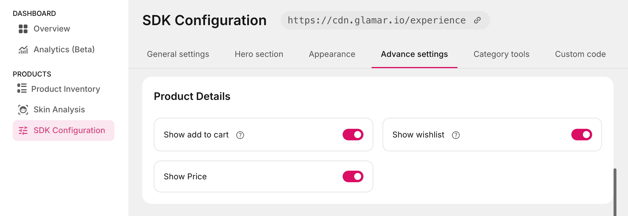
Product Details
The Product Details section allows you to toggle on or off various product-related options in the try-on window. The available options are:
- Show add to cart: Display the Add to cart button for quick product purchasing in a try-on window.
- Show wishlist: Display the wishlist option for saving products.
- Show Price: Display the product price.
Others
The Others section allows you to toggle several UI related options within the try-on window. These settings let you control which navigation and interface elements are available to users. The available options are:
- Allow Back: Enable or disable the back navigation option in the try-on window.
- Allow Close: Enable or disable the close button for exiting the try-on experience.
- Allow Camera Switch: Enables users to switch between the front and rear cameras when accessing the try-on window through a mobile interface.
- Allow Full-Screen: Allow the try-on window to expand to full-screen mode.
- Allow Product Name: Display or hide the product name within the try-on window.
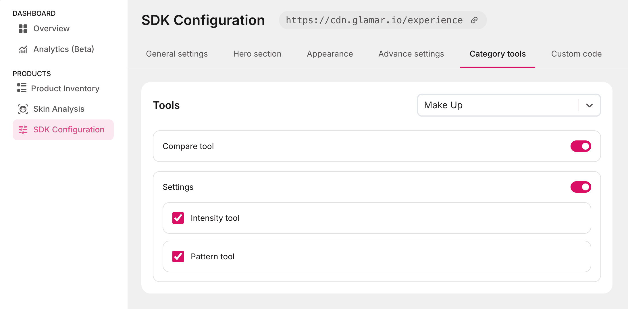
Category tools
Make Up
Compare tool
The Compare tool lets you view a side-by-side comparison of two products directly within the try-on window. This helps in quickly evaluating differences in features, appearance, or specifications without switching screens.
Supported categories:
- Make Up
- Eyewear
- Jewellery
- Rings
- Watches
Usage:
- Enable the toggle to activate the Compare tool for the selected category, in this case, Make Up.
- Click on the Publish button at the top-right corner of the window.
- In the try-on window, click on the
 button to generate a side-by-side comparison view.
Settings
The Settings option provides two configurable tools to customize the makeup try-on experience:
- Intensity tool: Adjusts the strength or opacity of the applied makeup, allowing for subtle or bold looks.
- Pattern tool: Applies patterns or textures to the makeup for creative effects.
Supported category:
- Make Up
Usage:
- Enable the Settings toggle to access both the Intensity tool and Pattern tool.
- Select the Intensity tool checkbox to enable the intensity slider in the try-on window, allowing users to adjust the makeup's opacity in real time.
- Select the Pattern tool checkbox to apply available patterns to the makeup effect.
Eyewear
Compare tool
See the Compare tool description for details. This tool is also available for the Eyewear category.
Settings
The Settings option for Eyewear includes two tools:
- Position adjustment tool: Allows movement of the eyewear overlay in the try-on window so it aligns correctly with the user's face.
- Measurement tool: It calculates the pupillary distance (PD) to ensure the 3D eyewear model fits accurately in try-on mode.

Instructions screen
The Instructions screen provides guidance to users during the PD measurement process. It contains two customizable sections:
Banner
A custom banner image displayed at the top of the instructions window. This allows you to add branding or visual context for your product or use case.
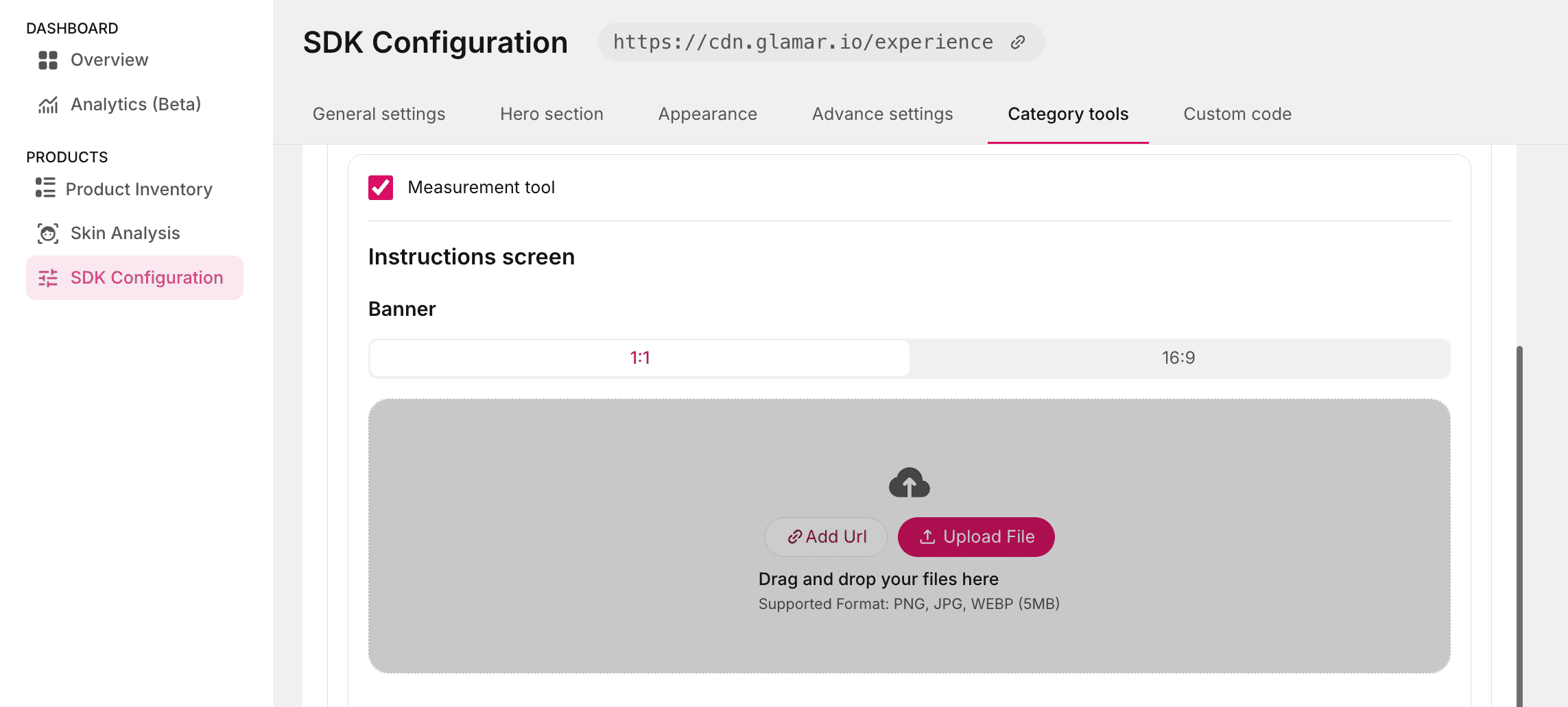
Image requirements:
- Aspect ratios: 1:1 or 16:9
- Formats: PNG, JPG, WEBM
- Max file size: 5 MB
Upload methods:
- Add URL: Click this button to add a direct link to the image.
- Upload File: Click this button to select an image from your local storage.
Content
Four editable text fields to display instructions tailored to your use case or product:
- Header Text: The main heading of the instructions screen.
- Instruction 1: The first step or guideline.
- Instruction 2: The second step or guideline.
- Instruction 3: The third step or guideline.
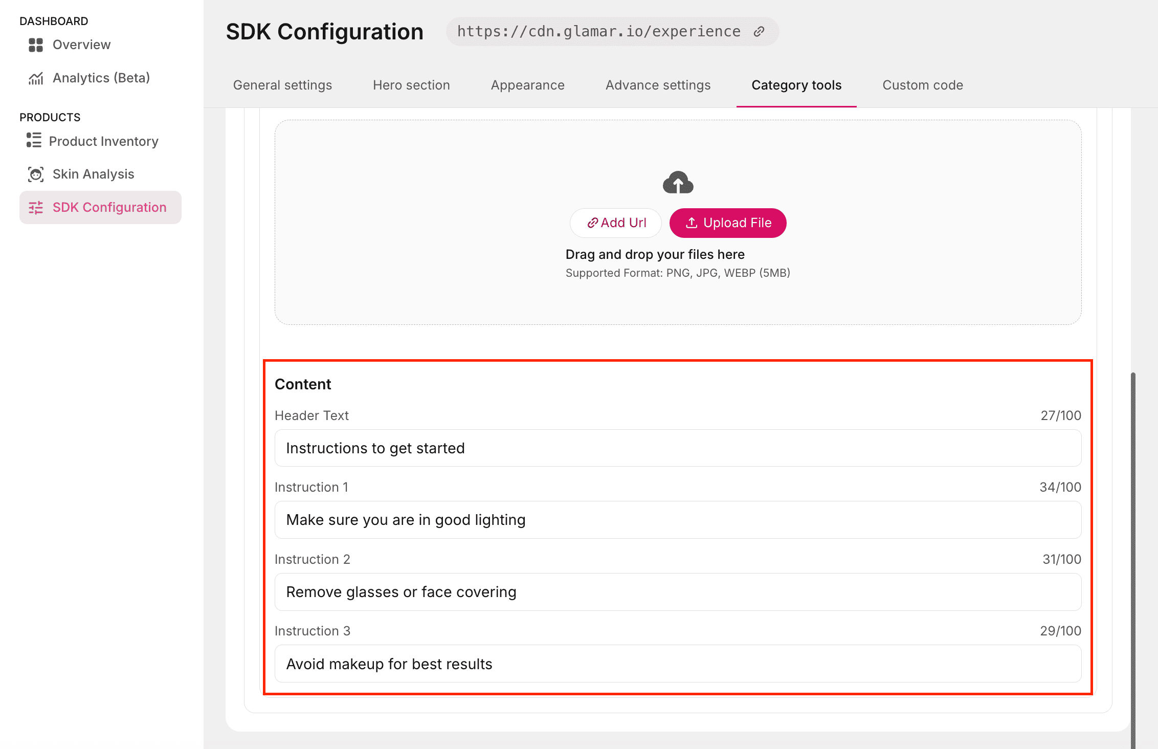
Use these fields to provide clear, concise directions that help users complete the measurement process accurately.
Keep instructions short, action-oriented, and relevant to the specific eyewear product being measured.
Jewellery
Compare tool
See the Compare tool description for details. This tool is also available for the Jewellery category.
Settings
Position adjust tool
Allows users to adjust the position of the 3D jewellery model in try-on mode. This ensures that the product aligns naturally with the user's face, neck, or ears depending on the jewellery type.
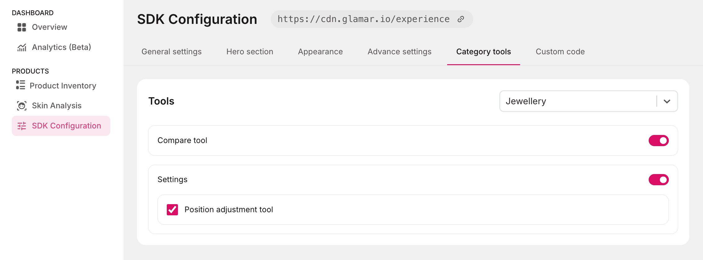
Usage:
- Click on the Position adjustment tool checkbox.
- Then click the Publish button on the top-right corner of the window.
- Use the on-screen controls to fine-tune the placement of the jewellery model for a realistic preview.
Rings
Compare tool
See the Compare tool description for details. This tool is also available for the Rings category.
Settings
The Settings toggle allows you to enable or disable the settings icon in the try-on window. Once enabled, it provides access to the Position adjustment tool and Measurement tool.

Position adjust tool
Lets users adjust the position of the 3D ring model in try-on mode to ensure accurate alignment on the finger.
Measurement tool
It measures ring fit and provides sizing guidance. The Measurement tool includes an Instructions screen for guiding users through the process.
Banner
A custom banner image displayed in the instructions window, useful for branding or providing visual guidance.
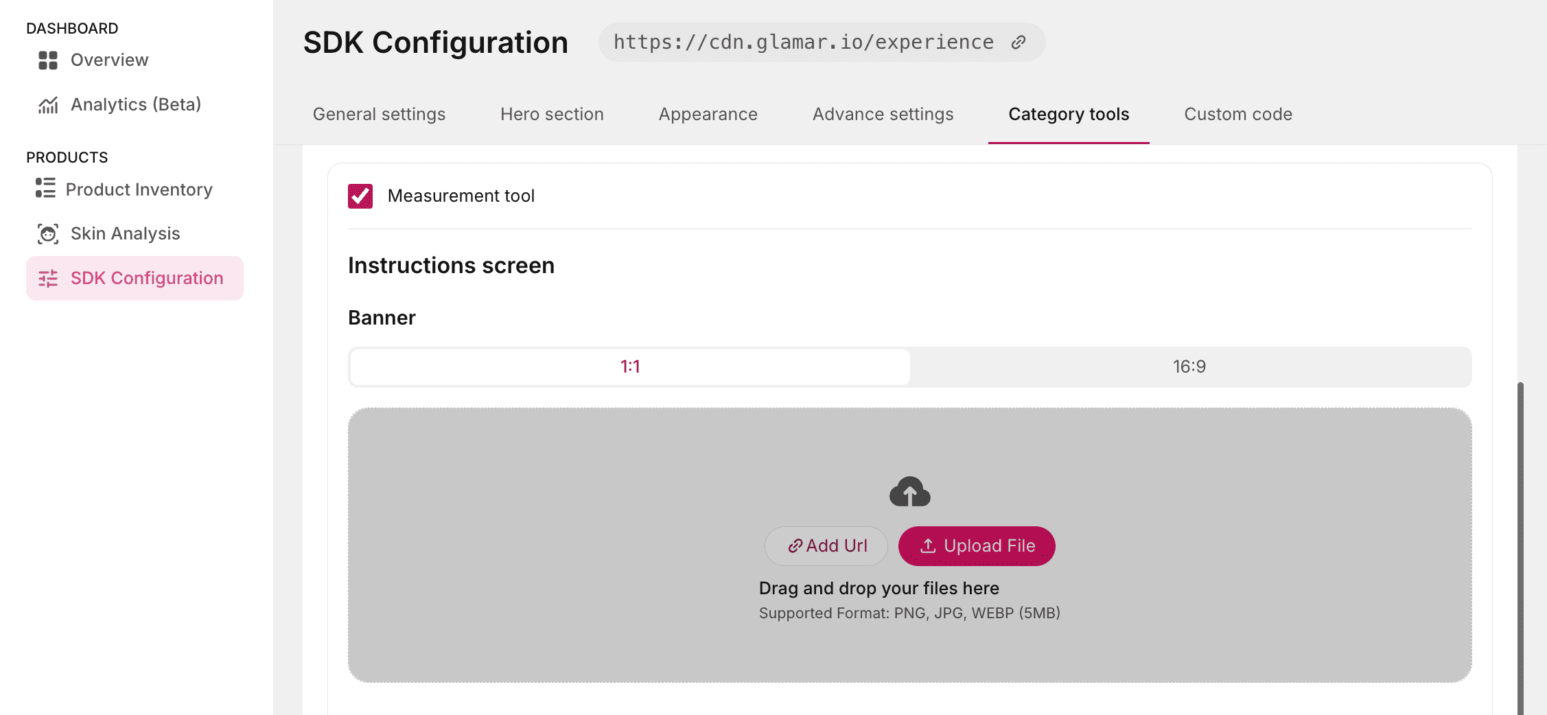
Image requirements:
- Aspect ratios: 1:1 or 16:9
- Supported formats: PNG, JPG, WEBM
- Maximum file size: 5 MB
Upload methods:
- Add URL: Click this button to add a direct link to the image.
- Upload File: Click this button to select an image from your local storage.
Content
Two editable text fields for displaying instructions:
- Header Text: The main heading for the instructions window.
- Sub Text: Supporting text to explain steps or provide additional guidance.
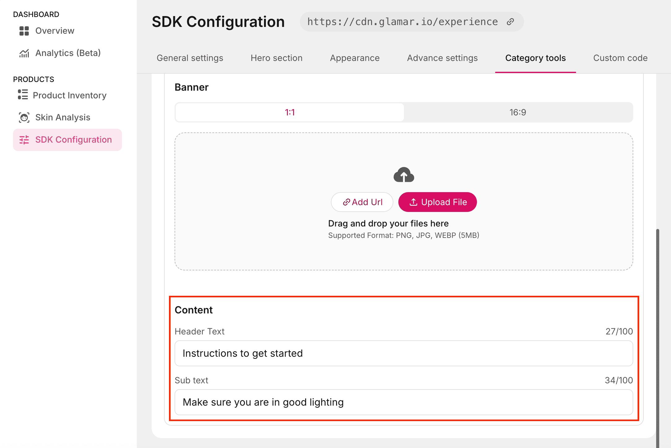
Use these fields to provide clear, concise directions that help users complete the measurement process accurately.
Watches
Compare tool
See the Compare tool description for details. This tool is also available for the Watches category.
Settings
The Settings toggle allows you to enable or disable the settings button in the try-on window. Once enabled, it provides access to the Position adjustment tool.

Position adjustment tool
It enables precise adjustment of the 3D watch model in try-on mode. This ensures the product aligns naturally with the user's wrist for a realistic and accurate preview.
Usage:
- Click on the Position adjustment tool checkbox.
- Then click the Publish button at the top-right corner of the window.
- Use the on-screen controls to reposition and align the watch model in real time.
Home
The Home category allows users to explore home decor products such as furniture, floor decor, wall decor, lighting, kitchen, and appliances in Augmented Reality (AR). This feature helps users visualize how products will look and fit within their own spaces.
Measure product
The Measure product tool enables users to measure home decor items in AR for accurate sizing and placement within their environment.
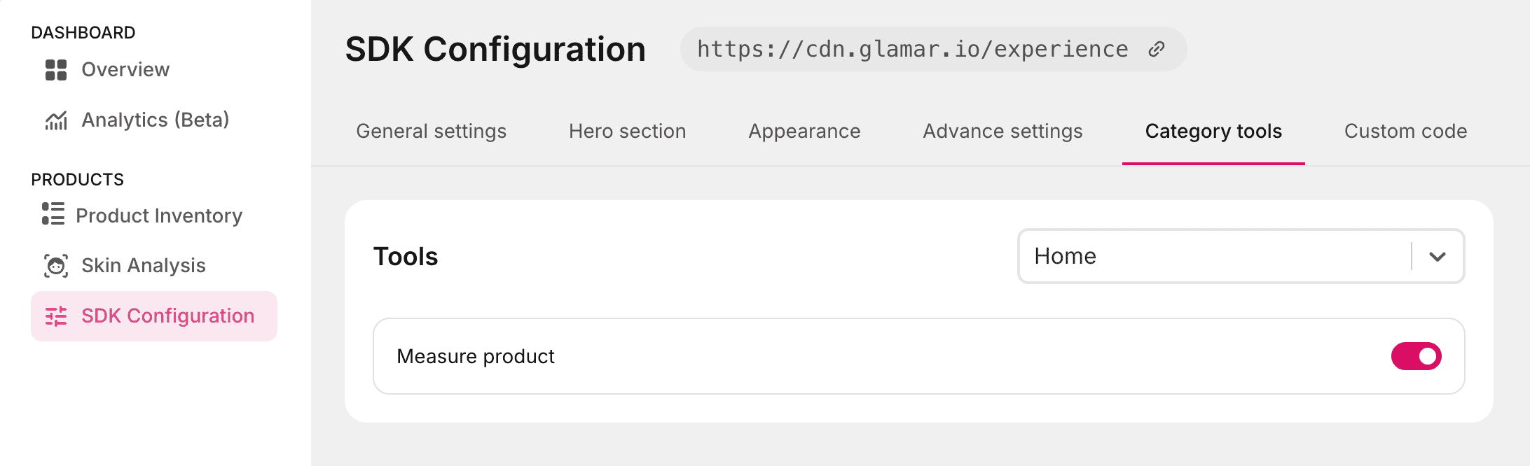
Usage:
- Enable the Measure product toggle to activate this tool in the try-on window.
- Then click the Publish button at the top-right corner of the window.
- Use the AR view to measure and preview products in real-world scale.
This tool is specific to the Home category and is not available in other product types.
Hair and Nail
The Hair and Nail categories use identical settings. These categories focus on surface overlay rendering and do not require facial anchor tracking.
Compare tool
See the Compare tool description for details. This tool is also available for the Hair and Nail categories.
Instructions screen
The Instructions screen provides guidance to users through try-on the process. It contains two customizable sections:
Banner
A custom banner image displayed at the top of the instructions window. This allows you to add branding or visual context for your product or use case.
Image requirements:
- Aspect ratios: 1:1 or 16:9
- Formats: PNG, JPG, WEBM
- Max file size: 5 MB
Upload methods:
- Add URL: Click this button to add a direct link to the image.
- Upload File: Click this button to select an image from your local storage.
Content
Four editable text fields to display instructions tailored to your use case or product:
- Header Text: The main heading of the instructions screen.
- Instruction 1: The first step or guideline.
- Instruction 2: The second step or guideline.
- Instruction 3: The third step or guideline.
Settings
The Settings option allows you to control additional tools displayed within the try-on window. When enabled, a settings button appears in the try-on window, and it provides users access to configurable controls during their try-on session.
Intensity tool
Enable the Intensity tool to display a slider within the try-on window. This slider lets users to adjust the intensity of the applied hair color or nail render in real time.
- Increasing intensity makes the applied shade appear more vibrant.
- Reducing intensity softens the visual effect for a more subtle look.
Disable this option if you prefer to maintain a fixed render strength without user control.
Pattern tool
Enable the Pattern tool to allow users to switch between available hair or nail patterns (if configured). This is useful for showcasing variations such as textures, gradients, or design styles within the same product category.
When disabled, users will only see the default applied pattern.
Back Camera
Enable the Back Camera toggle to allow users to switch between the front and rear cameras during the try-on session.
This is especially useful for:
- Nail try-ons, where users may prefer using the rear camera for better clarity.
- Hair visualization from different angles.
When enabled, a camera-switch option appears within the try-on interface.
Custom code
The Custom code tab is designed for advanced customization of the SDK's user interface and layout. It provides a built-in code editor where you can modify code to tailor the UI experience beyond the predefined options available in other configuration tabs.
Parameter details
| Key | Type | Default | Description |
|---|---|---|---|
allowToast | Boolean | false | Controls whether toast notifications are displayed inside the try-on window. |
openLiveOnInit | Boolean | false | If set to true, the live try-on window opens automatically on initialization. |
popUpOverrides | Object | { quit: false, result: false, restart: false } | Contains toggles to enable or disable specific pop-up dialogs. |
popUpOverrides.quit | Boolean | false | Controls the display of the quit confirmation pop-up. |
popUpOverrides.result | Boolean | false | Controls the display of the results pop-up after a try-on session. |
popUpOverrides.restart | Boolean | false | Controls the display of the restart pop-up when restarting the try-on flow. |
allowEyePdToast | Boolean | true | Controls the display of the pd popup at the beginning of try-on flow. |
screenOverrides | Object | {...} | Overrides entire UI screens, enabling or disabling them. |
heroScreen | Boolean | false | Controls visibility of the hero screen in the flow. |
domainBlock | Boolean | false | Displays or hides the domain restriction/block screen. |
billingBlock | Boolean | false | Displays or hides the billing-related restriction screen. |
cameraFailed | Boolean | false | Displays or hides the camera failure error screen. |
cameraAccessDenied | Boolean | false | Displays or hides the “Camera Access Denied” error screen. |
somethingWentWrong | Boolean | false | Displays or hides the generic error/fallback screen. |
allowBottomSheet | Boolean | false | Enables or disables the bottom sheet UI element in the try-on window. |
- All values are Boolean and can be set to
true(enabled) orfalse(disabled). screenOverridesandpopUpOverridesare nested objects: you can selectively override only the screens or pop-ups you need.- Default values are set to conservative values (
false) to avoid showing unnecessary screens/pop-ups unless explicitly enabled.
Saving and publishing changes
Once all SDK configuration updates are complete, you can choose how to save your changes:
- Reset to Default: Click Reset To Default to discard all changes and restore the configuration to its original state.
- Save a draft: Click the Save button to save the current configuration as a draft. Drafts allow you to store settings without making them live, so you can revisit and refine them later.
- Publish: Click the Publish button to apply and save all changes. Published settings are immediately reflected in the SDK.

Use save draft method while experimenting with configurations, and only publish once you're confident that the settings are ready for production.
See It in Action
Watch a step-by-step walkthrough showing how to configure GlamAR Virtual try-on SDK. This demo covers the full flow discussed above and helps you visualize each step before going live.