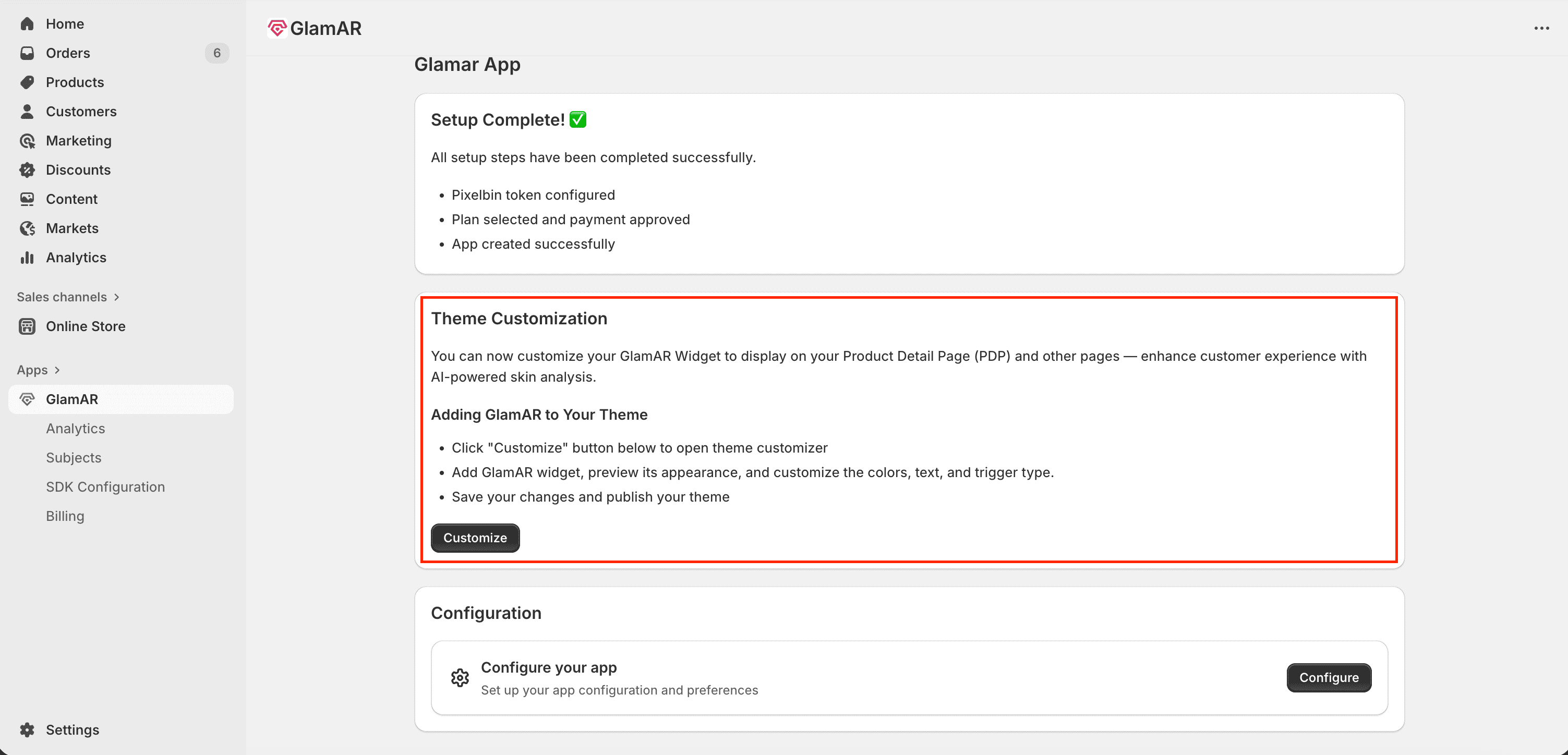
Configure the App
After setup completion, the next step is to configure your GlamAR app. Click the Configure button on the success screen to begin.
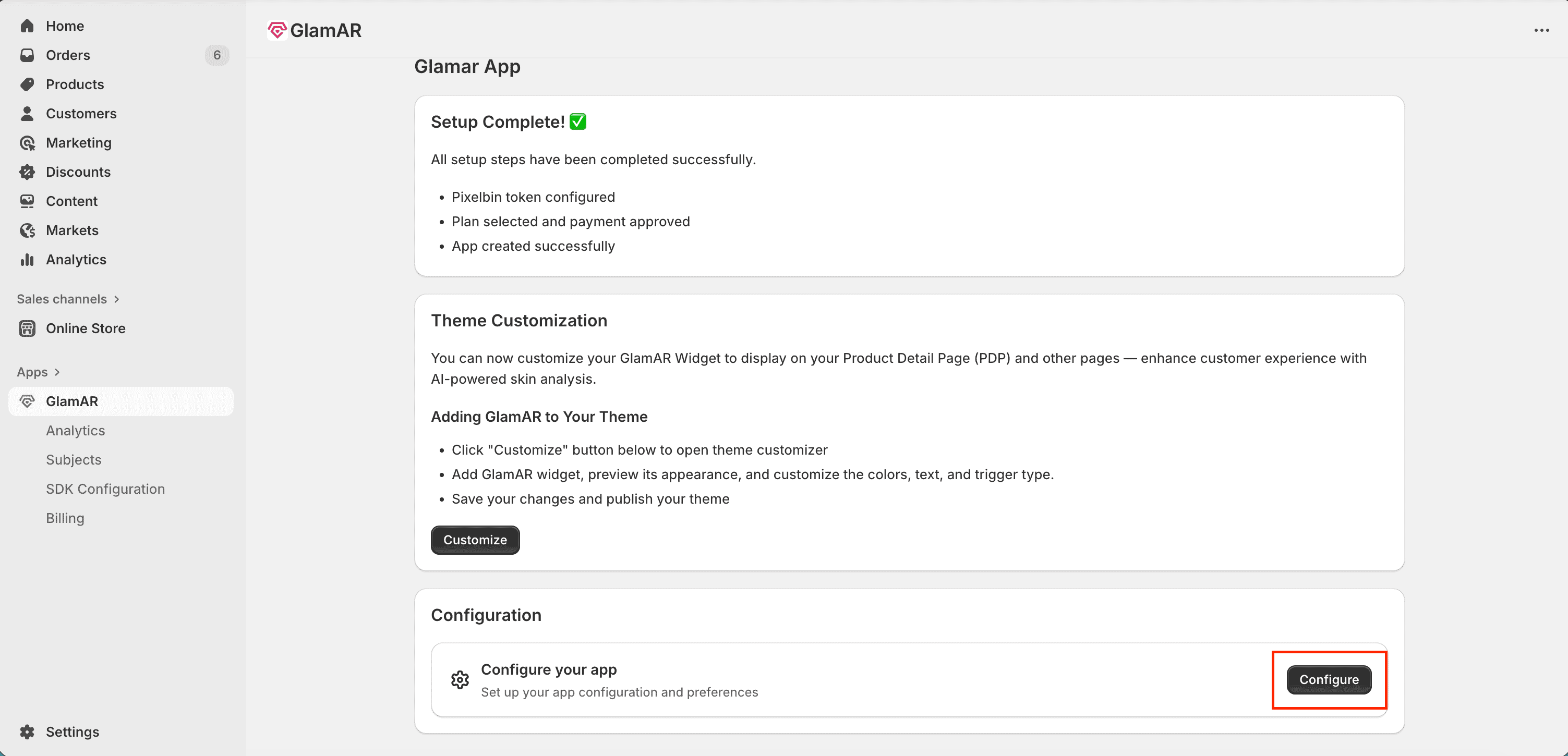
Clicking this button redirects you to the SDK Configuration page, where you can fine-tune your app's appearance, connectivity, and behavior before going live.
App Details
The App Details section contains key configuration options that define your app’s basic setup and accessibility.

Data storage
- Choose how long user data will be stored for analysis, reporting, and insights.
- Available options:
- None: No user data will be stored.
- 1 Year: Retains data securely for one year.
- 3 Years: Retains data securely for three years.
- All data storage durations comply with global privacy standards such as GDPR.
Preview on smartphone
- Generates a QR code that can be downloaded or printed for in-store testing.
- Scanning the QR code opens the app instantly on a smartphone, allowing you to preview the app’s live interface and behavior.
- Ideal for testing real-time try-on or analysis flows on mobile devices.
General link
- Provides a shareable link to open the app in a browser.
- You can click or copy the link to share it with team members, testers, or clients for collaboration and feedback.
SDK Configuration
The SDK Configuration area controls the app's UI, layout, and design preferences. It contains multiple tabs, starting with Appearance that help you tailor your app's interface.

Appearance
The Appearance tab focuses on typography and theme customization to align the app's visuals with your brand identity.
Typography
- Select the font family used throughout the app.
Available fonts:
- Inter
- Arial
- Helvetica
- Roboto
- Open Sans
- Lato
- Montserrat
- The selected font applies to all text elements in the UI including buttons, labels, and reports.
Theme Selection
- Choose a visual theme for the app's interface.
Available options:- Light: Bright and minimal layout ideal for clean branding.
- Dark: High-contrast design suited for modern or premium brand styles.
- Custom: Allows full control of color customization.
If Custom is selected, you can configure the following:
- Primary Color: The main color used across key UI elements and buttons.
- Icon Color: Defines the color of icons throughout the interface.
- Selection Color: Highlights selected states (like active tabs, toggles, or buttons).
Use your brand's primary and accent colors to maintain consistency across your Shopify storefront and GlamAR experience.
Banner
Allows you to customize the banner image displayed in the app. You can replace the default banner with any image that aligns with your brand or personal preference.

Usage:
- Upload a new image file from one of the following methods:
- Add URL: Paste the direct link to the image.
- Upload File: Select an image from your device.
- Supported aspect ratios: 1:1 and 16:9.
- Supported formats: PNG, JPG, WEBM.
- Maximum file size: 5 MB.
Text Fields
The Text Fields section defines the instructional text displayed to users before they begin using the facial scan. This ensures that users understand how to position themselves and prepare for accurate skin analysis results.
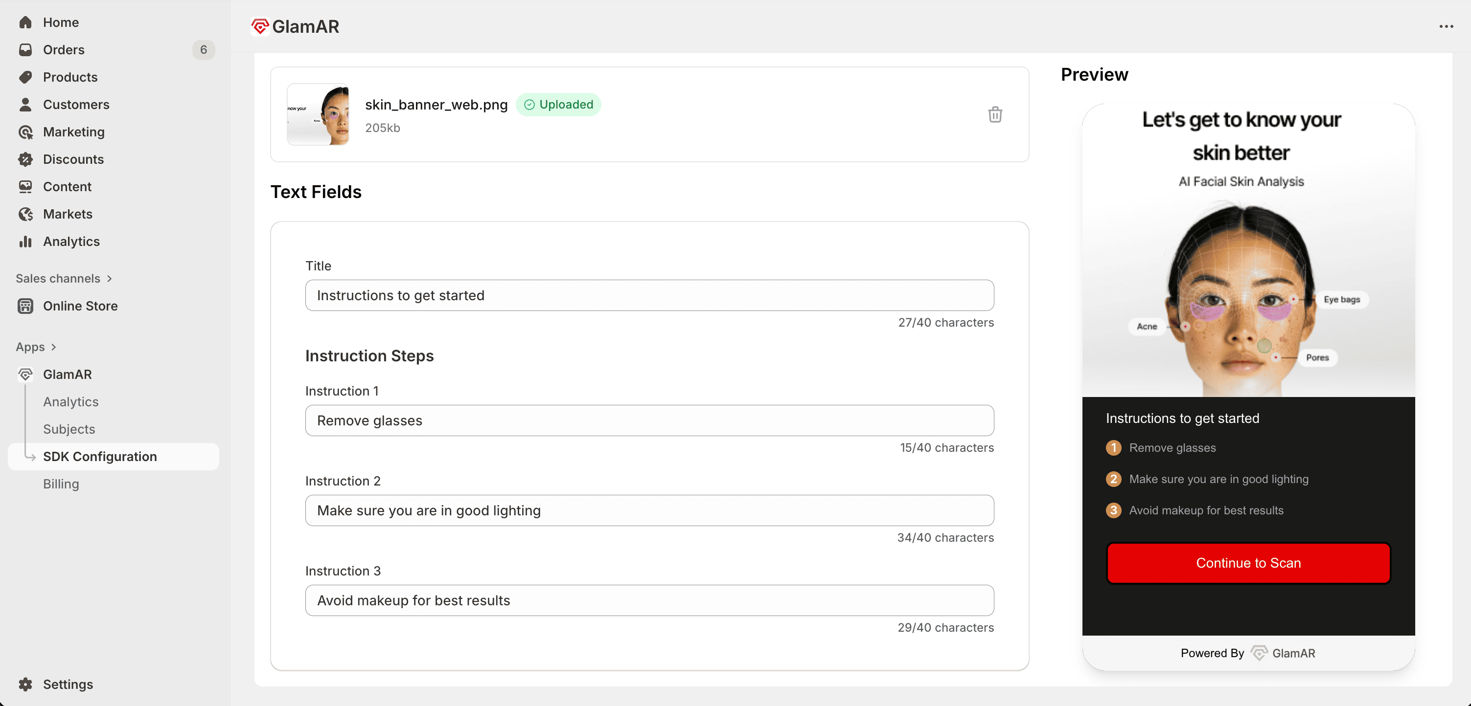
Title
- The main heading displayed at the top of the instruction screen.
- Typically used to introduce the scanning process (e.g., “Prepare for Your Skin Scan”).
Instruction 1
- The first line of guidance or preparation instruction.
- Example: “Remove glasses or accessories that cover your face.”
Instruction 2
- Provides an additional guideline to improve scan accuracy.
- Example: “Ensure your face is well-lit and free from shadows.”
Instruction 3
- Offers further steps or tips.
- Example: “Avoid makeup for best results.”
Report Setup
The Report Setup tab controls how the user’s Skin Analysis Report is generated and displayed within the GlamAR experience. It lets you define the report’s appearance, parameters, and additional AI-driven visualization options.
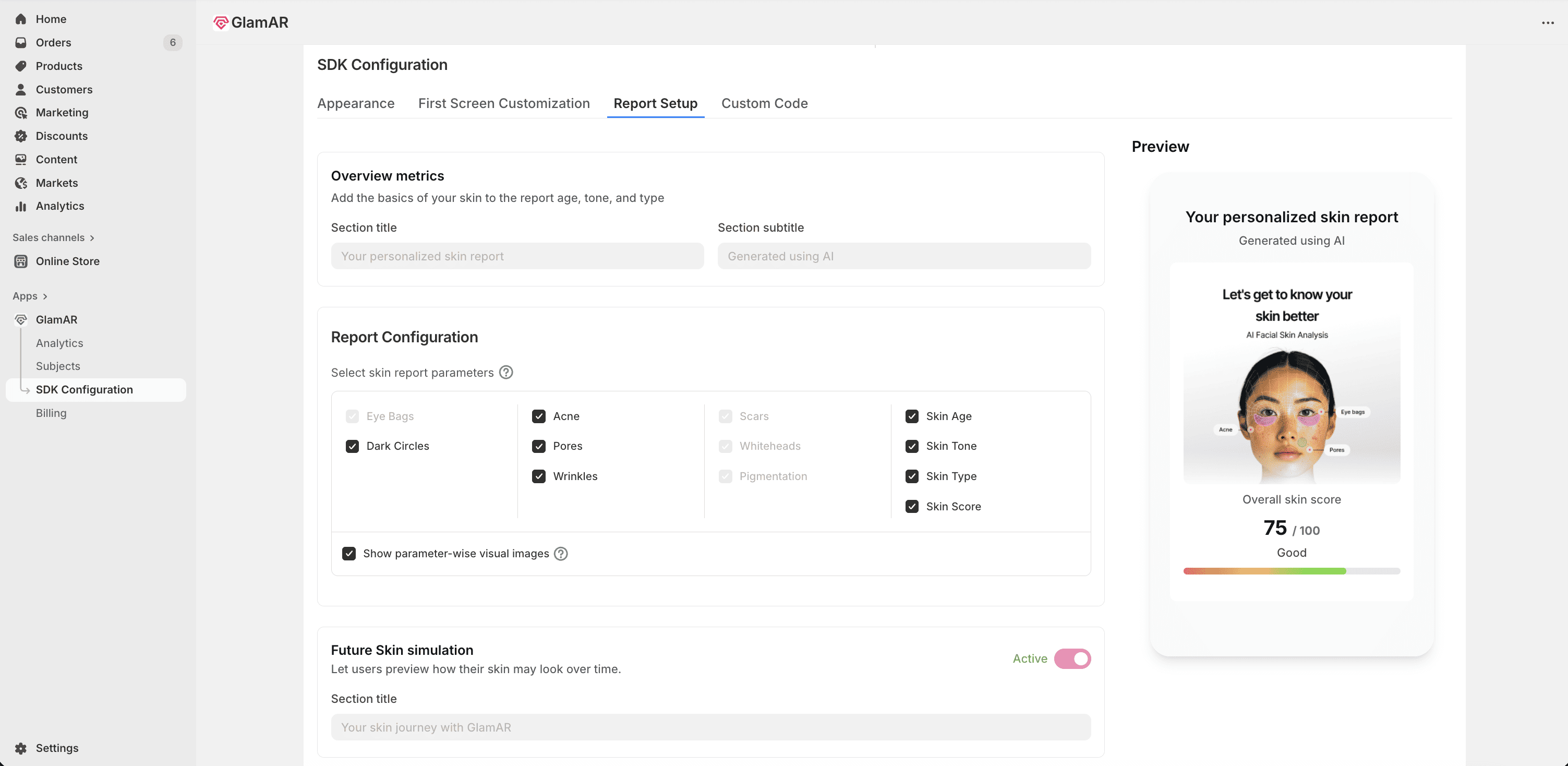
Overview Metrics
This section defines the introductory portion of the user’s skin analysis report.
- Section Title: Enter the main heading for the report’s overview section.
- Example: “Your Skin Health Summary”
- Section Subtitle: Add a short supporting line that provides additional context.
- Example: “Here’s a detailed view of your skin’s current condition.”
Keep titles short and meaningful to maintain visual balance in the final report layout.
Report Configuration
This section determines which skin concerns are included in the generated report.
- Skin report parameters: Choose which skin parameters to display in the user’s report, such as:
- Dark Circles
- Acne
- Pores
- Wrinkles and more
- Show parameter-wise visual images: Enable or disable this checkbox to control whether annotated visuals appear in the report.
- When enabled, the report includes highlighted skin areas corresponding to each detected concern (e.g., acne zones on the user’s photo).
- Disabling this option results in a text-based report without visual overlays.
Future Skin Simulation
- Toggle activate or deactivate to use the Future Skin Simulation feature.
- When enabled, GlamAR’s AI simulates how the user’s skin may change over time, based on current conditions and lifestyle indicators.
- The simulation provides visual projections that help users understand potential outcomes and take preventive action.
Best practices:
- Always include key parameters such as Acne, Pores, and Wrinkles for a balanced skin health summary.
- Test the final report layout using sample data before publishing changes.
- Keep section titles concise (40-character limit) and subtitles within 100 characters for optimal formatting.
- Use Future Skin Simulation to enhance engagement and provide predictive insights.
Custom Code
The Custom Code tab gives advanced users and developers full control over the app’s behavior within the GlamAR SDK environment. It allows you to modify predefined configuration parameters through editable JSON code. These settings primarily manage system pop-ups, error screens, and certain UI interactions.
Configuration Parameters:
| Parameter | Type | Default Value | Description |
|---|---|---|---|
disableToast | Boolean | true | Controls whether toast notifications appear in the skin analysis window. When true, minor messages such as warnings or confirmations are hidden. |
openLiveOnInit | Boolean | false | When set to true, it automatically opens the live camera feed when the app loads. |
popUpOverrides.quit | Boolean | false | Toggles the Quit Confirmation popup when users attempt to exit. true disables the popup. |
popUpOverrides.result | Boolean | false | Controls the Results Summary popup after a scan or analysis completes. true disables the popup. |
popUpOverrides.restart | Boolean | false | Toggles the Restart Confirmation popup. true disables it, allowing instant restarts. |
screenOverrides.heroScreen | Boolean | false | Enables or disables the Hero Screen (initial splash or welcome screen). true skips this screen. |
screenOverrides.domainBlock | Boolean | false | Determines if the Domain Restriction screen should appear when the current domain isn't whitelisted. true bypasses it. |
screenOverrides.billingBlock | Boolean | false | Enables or disables the Billing Block screen, which appears during subscription or billing issues. |
screenOverrides.cameraFailed | Boolean | false | Controls the Camera Failed screen shown when the camera cannot initialize. true disables the error message. |
screenOverrides.cameraAccessDenied | Boolean | false | Toggles the Camera Access Denied message shown when user permissions are restricted. |
screenOverrides.somethingWentWrong | Boolean | false | Toggles the fallback Something Went Wrong screen for unexpected system or SDK errors. |
- Use
trueto disable specific pop-ups or screens andfalseto keep them active. - Always review your JSON syntax before saving; invalid formatting can cause app failures.
- Keep key error messages (like Camera Access Denied) enabled to improve user troubleshooting.
- For debugging, temporarily enable toast notifications (
"disableToast": false) to get real-time error feedback. - Test configuration changes in preview mode before pushing them live.
Saving the Changes
Once all configurations and edits are complete, you can make your updates live by clicking the Save button located at the top-right corner of the interface.

Integrating GlamAR SDK into Shopify Theme
After completing the SDK configuration, the next step is to integrate the GlamAR SDK into your Shopify theme. This step ensures that the GlamAR component is properly embedded and functional within your storefront, enabling customers to interact with skin analysis directly on product pages. Integrating the SDK provides a seamless connection between GlamAR’s AI engine and your Shopify store which enhances the shopping experience.
Open Shopify Theme Editor
- In your Shopify Admin Dashboard, navigate to the Apps section from the left pane.
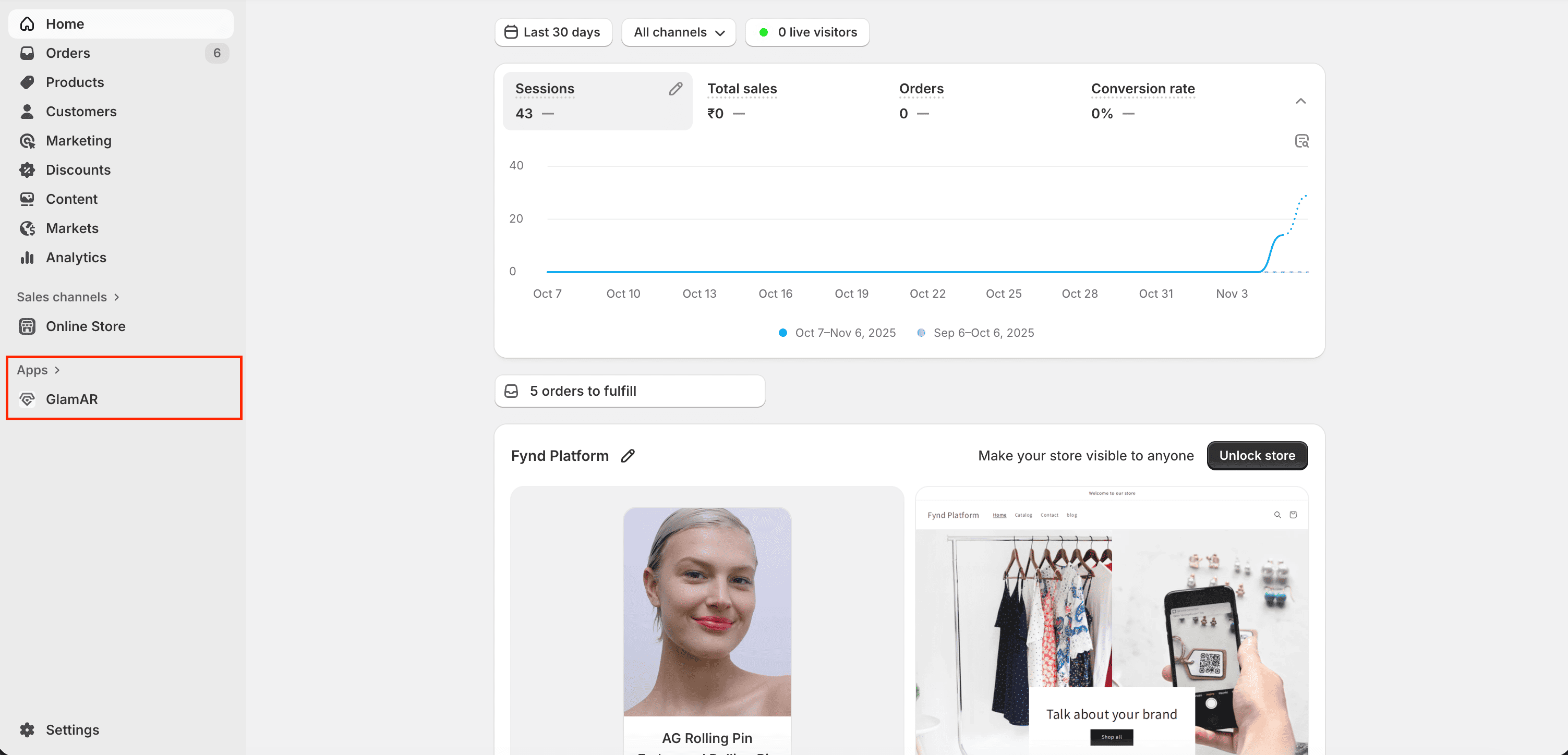
- Click on GlamAR to open the app’s configuration options.
- Under the Theme Customization section, click the Customize button.
This opens Shopify’s built-in theme editor, where you can manage and adjust how GlamAR widgets appear across your storefront pages.
Integrating the GlamAR Component
After opening Shopify’s built-in theme editor, you can add and configure the GlamAR component to display on your store’s pages, most commonly on the Product Detail Page (PDP). This component allows customers to interact with GlamAR’s AI-powered facial skin analysis features directly from your storefront, improving engagement and purchase confidence. Following steps discuss how to customize GlamAR widget:
- In the left pane, under the Template section, click Add section.
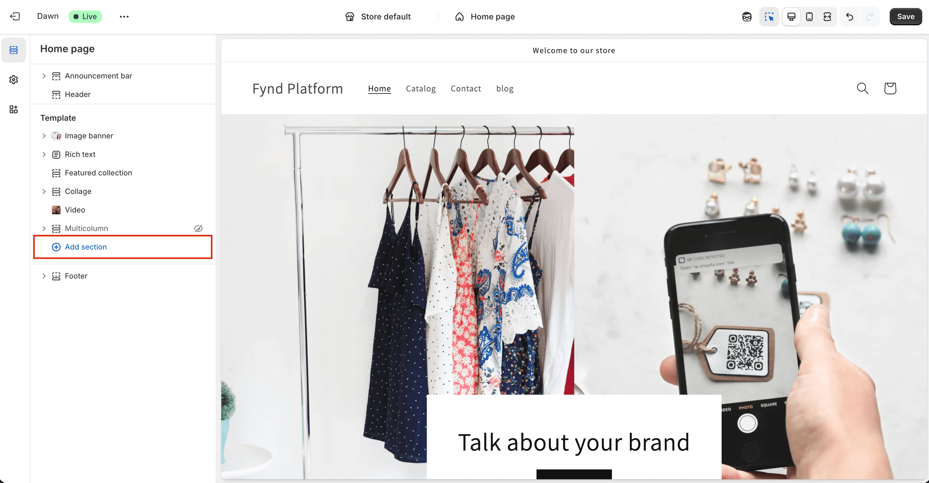
- This opens a panel listing all available elements you can add to your theme. These are listed under Sections:
- Image Banner
- Rich Text (heading and description)
- Collapsible Content
- Navigate to the Apps tab and select GlamAR from the list.
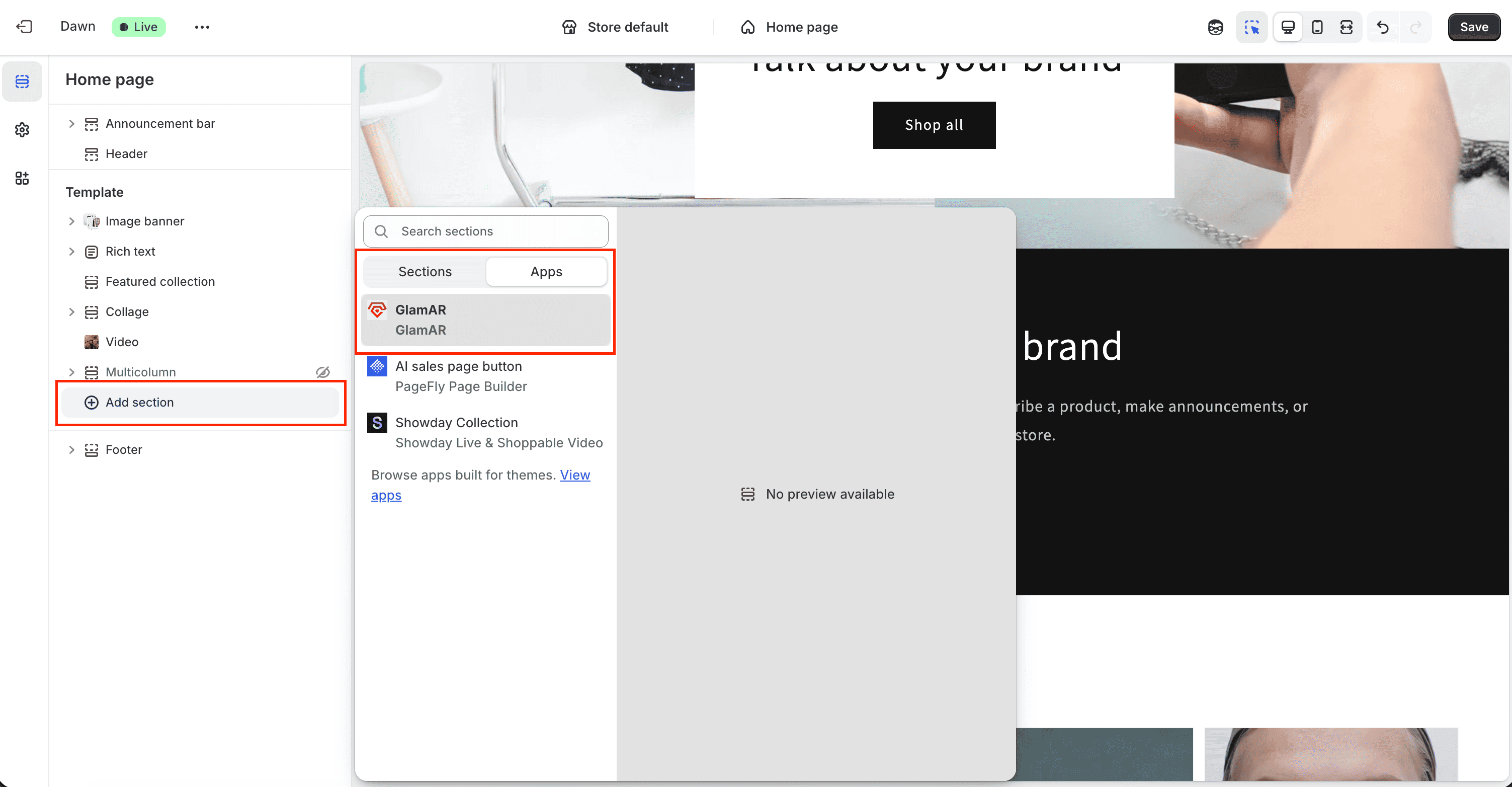
- Shopify will automatically insert a GlamAR button into your page template.
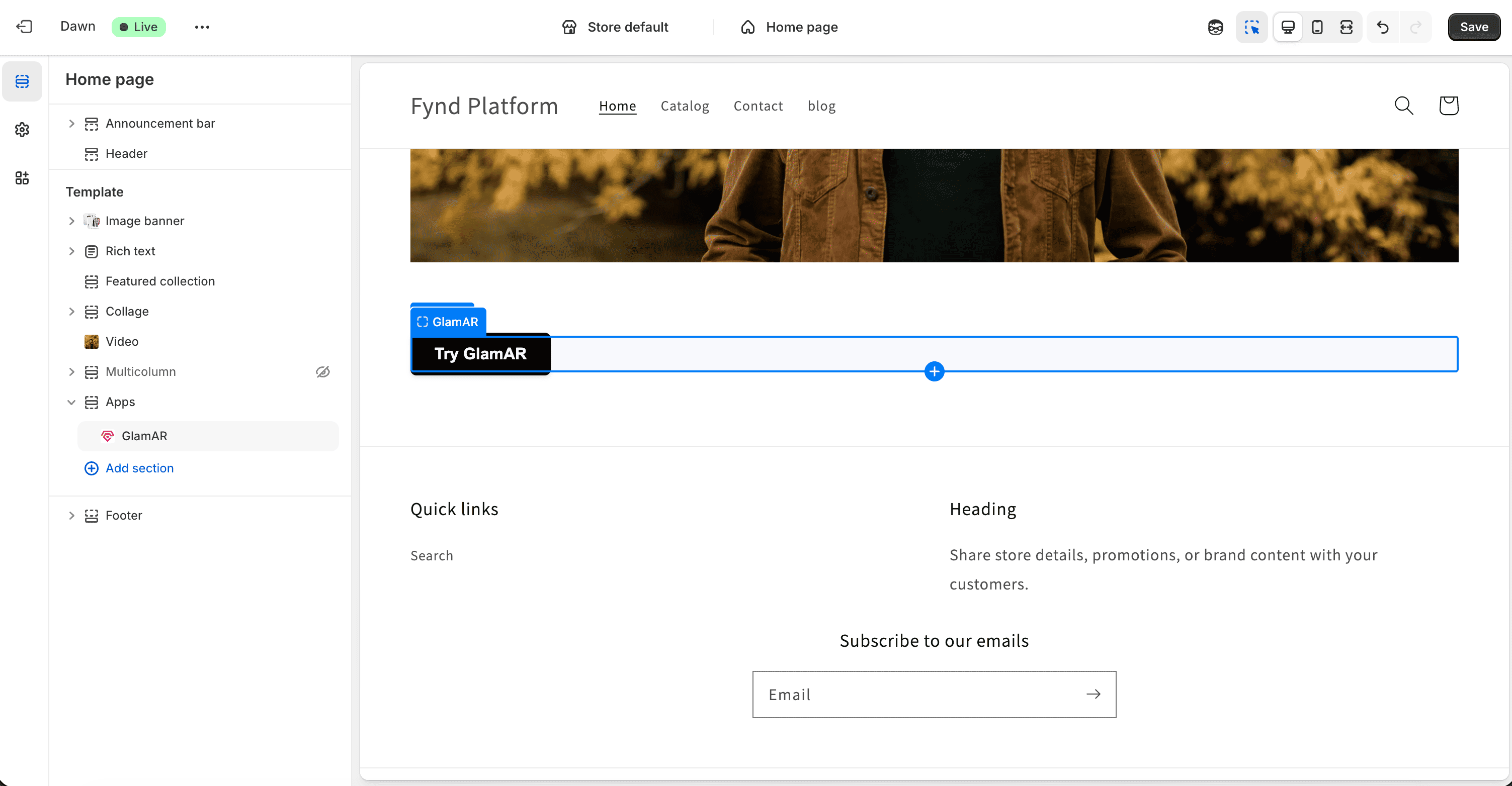
The GlamAR widget can be placed anywhere within the product page layout to best suit your design. For most stores, placing it near the product images works best for visibility and engagement.
Configuring the GlamAR Component
After adding the GlamAR component to your Shopify theme, you can customize how it looks and behaves on your storefront. These options help you tailor the widget’s interaction to fit your brand design and create a seamless customer experience.
To begin customization:
- Click the newly added GlamAR button in the preview pane.
- The available settings will appear in the left configuration panel of the Shopify theme editor.
Trigger Options
Trigger Options define how users initiate the GlamAR experience on your store. Whether through a banner image, button, or an icon. This flexibility allows you to align the widget interaction with your page layout and design preferences.
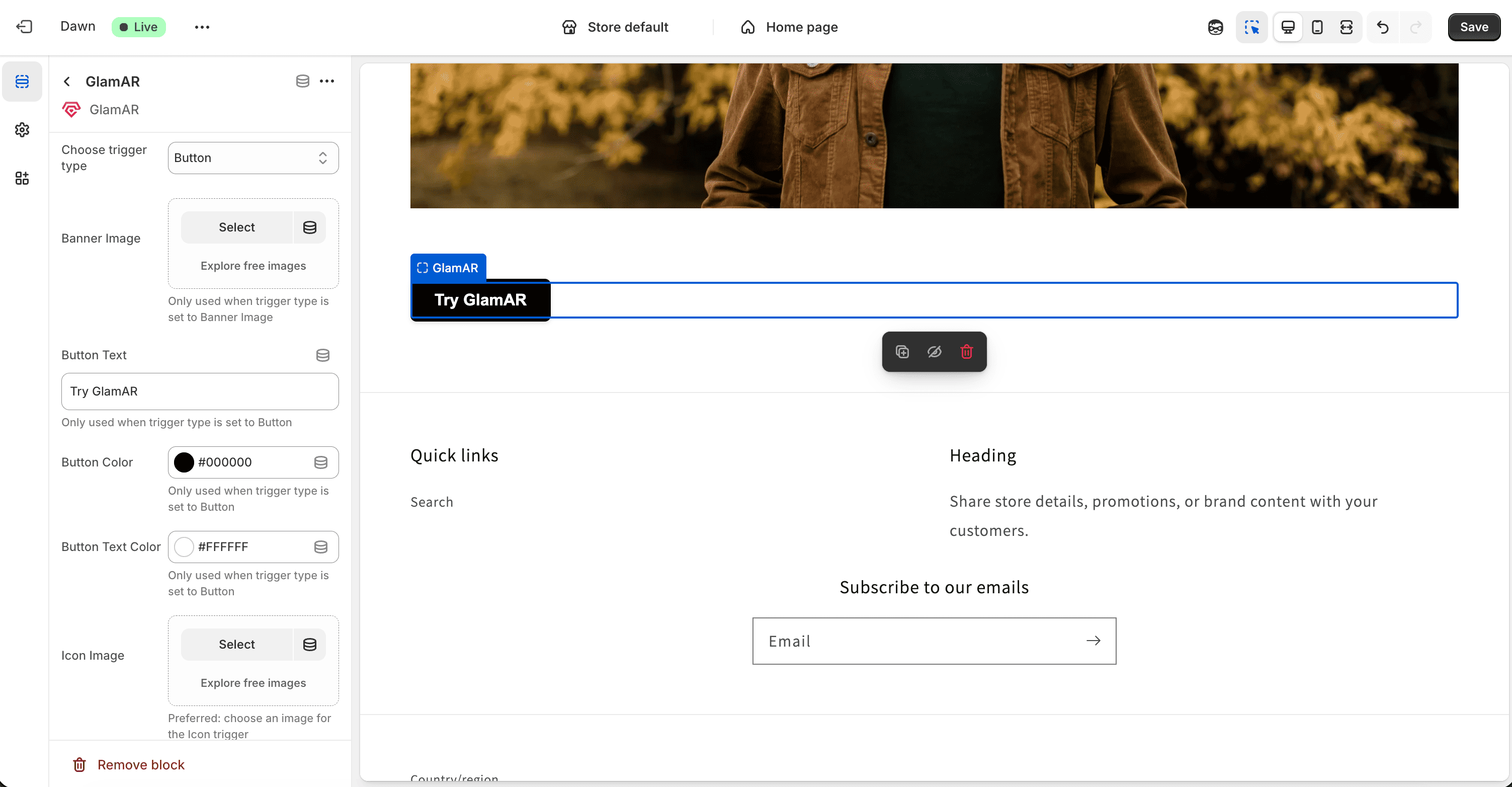
- Banner Image: Displays a full-width or sectioned banner that users can click or tap to launch the GlamAR widget.
- Button: Displays a classic call-to-action button (e.g., “Analyze My Skin” or “Try It On”). It’s ideal for product detail pages (PDPs) where clear, action-driven UI elements perform best.
- Icon: Adds a small, clickable icon. Perfect for minimalistic layouts or mobile screens where space is limited. Icons can be styled to match your brand aesthetics.
Choose a trigger type that best complements your store’s user flow. For instance, use banners for landing pages, buttons for PDPs, and icons for compact UI layouts.
Banner Image
If you select Banner Image as the trigger:
- Upload a high-resolution banner that will serve as the primary trigger for launching the GlamAR experience. You also get an option to choose free images from Shopify.
- The banner can be placed anywhere on your page and often works best near product imagery or as a top banner on PDPs.
Use Cases:
- Highlighting new product lines or seasonal campaigns.
- Encouraging interaction from customers through visual engagement.
Keep the banner clean and avoid text-heavy graphics. Instead, use imagery that clearly represents the facial skin analysis experience (e.g., model faces, product visuals).
Button Customization
When Button is selected as the trigger option, several customization settings appear:
- Button Text: Enter the label for your button (e.g., “Start Skin Scan”, “Analyze My Skin”).
- Button Color: Define the background color to match your store's color palette. Use contrasting colors to make the button stand out.
- Button Text Color: Adjust the text color for readability and brand consistency.
Design Tips:
- Keep button text short (2–4 words) to maintain clarity and visual balance.
- Test different color combinations to ensure the button remains visible on both desktop and mobile views.
Best Placement:
- Just below the Add to Cart button on product pages for higher visibility.
- Embedded within product galleries to catch user attention early.
Icon Customization
If you choose Icon as your trigger type:
- Icon Image: Upload a small graphic or icon (e.g., camera, sparkle, face scan symbol).
- Icon Size: Adjust the dimensions to ensure visibility without disrupting page layout.
Use Cases:
- Ideal for mobile-friendly layouts or minimalist store designs.
- Commonly placed near product images or as a floating icon at the corner of the screen.
Design Tips:
- Use clean, vector-style icons for sharp display across devices.
- Maintain consistent icon color with other UI elements.
- Test visibility against various backgrounds, especially on product images.
Icons work great as subtle triggers that don't distract from your main page content but still offer quick access to GlamAR features.
Manage App
- Click Manage App to return to the App Configuration page, where you can update SDK settings and theme configuration.
- For a complete breakdown of these settings, refer to the Configure the App section.
Remove Block
- To remove the GlamAR widget from your page, click Remove Block.
- This will delete the widget from the Apps section of your theme editor.
- You can re-add the GlamAR widget anytime by navigating to Add Section → Apps → GlamAR.
Saving and Publishing Changes
Once you've completed all widget and theme customizations, click Save in the top-right corner of the Shopify theme editor. This will apply and publish your changes across the selected store theme.
Ensure you save after each major edit, unsaved changes will be lost if you navigate away or close the editor.
Previewing Your Store
To preview how your customized GlamAR widget appears on your live storefront:
- In the theme editor, click the three dots (...) menu at the top-left corner.
- Select View from the dropdown.
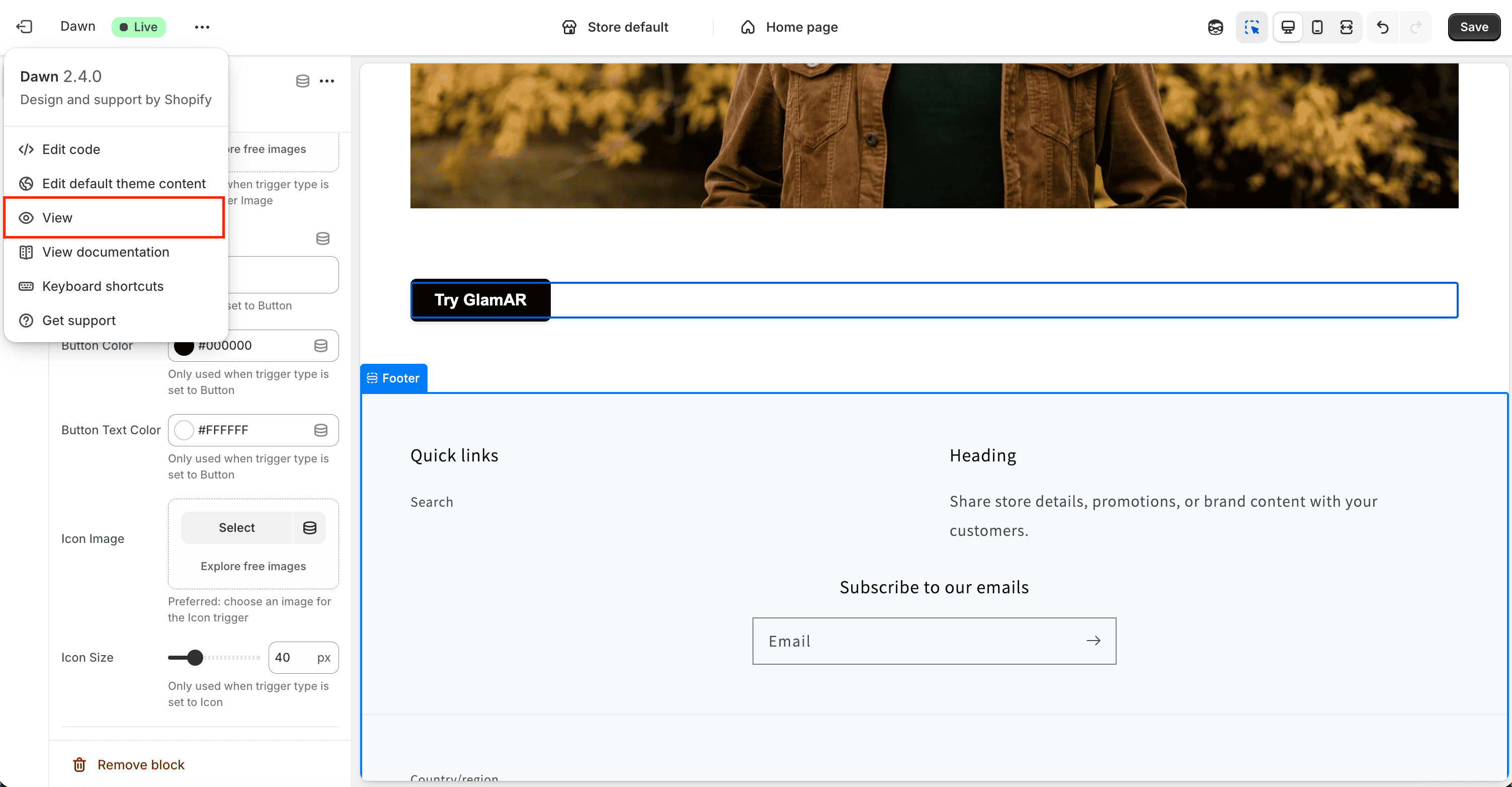
- A new browser tab opens showing your Shopify storefront with the updated GlamAR widget integrated on the product detail page and any other configured pages.
Use this preview to test widget placement, color alignment, trigger functionality, and responsiveness across devices.
Testing the GlamAR Widget
After saving your theme and widget settings, you can test the functionality of the GlamAR widget directly within your Shopify storefront preview. This step helps verify that the integration and interactive elements (such as buttons, icons, or banners) are working as intended.
How to Test
- In the View mode, locate the GlamAR widget on your product detail page or wherever it was added.
- Click on the configured trigger element, for example, the Button, Banner Image, or Icon to activate the widget.
- Once clicked, the Facial Skin Analysis window should open within the page.
- The system will automatically begin the AI-powered skin analysis process, scanning and identifying the user's facial parameters.
- Wait for the process to complete and verify that the analysis report loads correctly with results and visuals.
Analytics
The Analytics section in the GlamAR Shopify Plugin provides an overview of your app's performance, usage insights, and customer interaction data. It helps you monitor how users engage with GlamAR's AI-powered features across your Shopify storefront.
Once users start utilizing the AI Facial Skin Analysis feature on their Shopify store, the Analytics section provides detailed insights into how customers interact with GlamAR's AI-powered experiences and how the system performs over time.
The analytics dashboard offers key metrics that track user activity, performance trends, and AI usage. It enables merchants to evaluate the effectiveness of skin analysis reports.
Time Range
You can view analytics for different time periods using the Time Range selector. Four range types are available:
| Range Type | Available Options |
|---|---|
| Current | Current Day, Current Week, Current Month, Current Quarter, Current Year |
| Last | Last 24 Hours, Last 7 Days, Last 30 Days |
| Previous | Previous Calendar Week, Previous Calendar Month, Previous Calendar Year |
| Custom | Select custom start and end dates |
Overview Cards
On the dashboard, five cards display high-level metrics related to skin analysis usage and distribution. These cards update automatically when you change the selected application or time range.
- Total Skin Analysis Scans: Displays the total number of scans performed within the selected time period. This metric gives a quick view of how frequently users are engaging with the skin analysis feature.
- Skin Type Breakdown: Shows the distribution of detected skin types, such as Oily, Dry, Normal, or Combination. This helps identify the diversity of user skin profiles.
- Skin Tone Breakdown: Visualizes the proportion of different skin tones detected across scans. Understanding tone distribution helps ensure inclusivity and dataset accuracy.
- Skin Analysis OS Split: Indicates which operating systems users used to run the analysis, such as Windows, macOS, or Android.
- Skin Analysis Device Count: Displays the number and type of devices used for scans, helping track whether users primarily access the feature via mobile or web.
Skin Analysis Report Summary
The Skin Analysis Report Summary table is generated after each skin analysis scan. It provides detailed diagnostic results and scores for key skin concerns, helping evaluate overall skin health and condition severity.
- Concerns: The detected skin conditions analyzed during each scan, such as Hydration, Pigmentation, Pores, Eye Bags, etc.
- Top Concern (Score): The concern with the lowest or most critical score from the analysis, indicating the primary area for improvement.
- Good / Average / Bad: Categorizes scan results based on their scoring ranges.
- Average Score: Represents the mean score for each concern, summarizing the user's overall skin condition.
Subjects
The Subjects section is automatically populated once users begin performing skin scans through the GlamAR integration. Each subject represents a unique scan session, capturing a single user's skin analysis data and report.
This section displays a list of scanned reports generated through your Skin Analysis app. Each report corresponds to a unique scan, identified by a Subject ID. Refer Subjects section from Skin Analysis guide for more information.