UI customization
Capture IQ ships with a default, production-tested UI (Svelte inside <glamar-captureiq>). You can change colors, typography, buttons, and layout details to match your product without forking the widget.
On this page:
- Two ways to change how it looks: design tokens (CSS variables) and custom CSS (rules inside the shadow tree).
- How to apply those rules:
stylesattribute,@import, orelement.styles. - Screen-wise styling: which flow state maps to which root classes, and how to scope selectors so you do not restyle the wrong screen.
- A thumbnail gallery (280×280) of the main face preset screens, each with a commented selector map you can paste into your shadow CSS.
To change copy (button labels, hints), use config.ui in JSON—see Configuration. This page is about visual styling only.
For the full selector tables and edge cases, see the monorepo file services/goten/packages/captureIq/docs/styling-selectors-by-screen.md (and customization-ui-styles.md for CSP/CORS and token lists).
Two ways to customize Capture IQ
1. Design tokens (CSS variables on the host)
Set custom properties on <glamar-captureiq> (inline style, a class on your page, or inside the styles string using :host { … }). The bundled theme defines tokens such as --captureiq-text-body, --text-default, and spacing/typography scales; components read them with var(…).
Best for: global brand alignment—one place to set fonts, default text color, type scale, and shared button colors without listing every class.
2. Custom CSS (stylesheet inside the shadow tree)
Provide a CSS string via the styles attribute or element.styles property. That string is injected inside the open shadow root (after the default theme), so you can use any valid CSS: class selectors, media queries, and @import url("…") to load an external CSS file served from your CDN.
Best for: per-screen tweaks, one-off overrides, or a large brand sheet maintained outside HTML attributes.
You can combine both: tokens for defaults, plus a small styles block for exceptions.
Shadow DOM in one minute
| What you do | Does it style inside the widget? |
|---|---|
Normal page CSS targeting .flow-review .btn | No — shadow DOM hides internal classes from outer stylesheets. |
CSS on glamar-captureiq itself (width, height, max-width) | Yes — the host is in the light DOM. |
CSS variables set on <glamar-captureiq> | Yes — they inherit into the shadow tree where components use var(…). |
Rules in styles / element.styles / @import | Yes — those rules run inside the shadow tree. |
Applying custom CSS (API)
Use the same styles API everywhere; choose how you pack the string.
Option A: Tokens only (:host inside styles or on the tag)
<glamar-captureiq
  api-key="YOUR_KEY"
  preset="face"
  style="--text-default: #f8fafc; --captureiq-text-body: clamp(16px, 1.2vw, 18px);"
></glamar-captureiq>
Or pass tokens through the injected sheet:
<glamar-captureiq
  api-key="YOUR_KEY"
  preset="face"
  styles=":host { --text-default: #f8fafc; font-family: 'Inter', system-ui, sans-serif; }"
></glamar-captureiq>
Option B: Inline CSS in the styles attribute
<glamar-captureiq
  api-key="YOUR_KEY"
  preset="face"
  styles=".flow-review .btn.primary { border-radius: 12px; } .flow-idle .title { letter-spacing: 0.02em; }"
></glamar-captureiq>
Option C: External CSS file (@import)
<glamar-captureiq
  api-key="YOUR_KEY"
  preset="face"
  styles="@import url('https://cdn.example.com/capture-iq-brand.css');"
></glamar-captureiq>
Use standard @import url("…");. Ensure your CSP allows the fetch (style-src, often connect-src for cross-origin URLs).
Option D: element.styles (JavaScript, long CSS)
const el = document.querySelector("glamar-captureiq");
el.styles = `
  :host { --captureiq-text-subtitle: clamp(18px, 1vw, 22px); }
  @import url("/assets/captureiq-overrides.css");
`;
// Restore attribute-driven styles:
el.styles = null;
The property overrides the styles attribute until cleared. See Configuration for precedence with other options.
Common styling cases
Fonts and type scale
@import url("https://fonts.googleapis.com/css2?family=Inter:wght@400;600&display=swap");

:host {
  font-family: "Inter", system-ui, sans-serif;
}

.flow-idle .title {
  font-weight: 600;
}
Text and background
:host {
  --text-default: #f1f5f9;
}

.flow-review {
  background: #020617;
}
Primary / secondary buttons (review screen)
.flow-review .btn.primary {
  background: #2563eb;
  color: #fff;
  border-radius: 10px;
}

.flow-review .btn.secondary {
  border-color: rgba(255, 255, 255, 0.85);
  color: #fff;
}
Combine with tokens on :host where the theme exposes them (see theme.css in the Capture IQ package).
Styling by screen
Capture IQ moves through flow states. Each state mounts a small set of root classes you should use to scope your rules—so a .bottom-gradient rule does not accidentally match Review, Ready to capture, and Lighting at once.
Flow states → roots (face preset)
| Flow state | Main UI | Scope your CSS with… |
|---|---|---|
idle | Idle welcome | .flow-idle |
initializing / permission | Initializing + loader | .flow-initializing, loader classes |
preview | Live camera | .stage / video layer (see selector doc) |
guiding | Guidance (placement, lighting, distance, head pose, …) | .flow-guidance + step-specific classes |
readyToCapture | Countdown | .flow-ready |
capturing | Capturing flash / overlay | .flow-capturing |
review | Retake / Use photo | .flow-review |
success | Success | .flow-success |
error | Error | .error-root / error screen classes |
Under guiding, several overlays share the same parent; prefer the most specific stable class (for example .face-placement, .container under lighting only if scoped: .flow-guidance .container—test overlap with other .container usage; the monorepo doc lists safer paths).
Scoping rules of thumb
- Always prefix with
.flow-idle,.flow-guidance,.flow-ready, or.flow-reviewwhen a class name is generic (.message,.container,.bottom-gradient). - Prefer semantic hooks from the selector reference:
.face-placement-text,.meter .bar,.head-pose-measurer,.quality-panel. - Do not rely on hashed
svelte-*class names—they can change on any release.
Screen gallery (thumbnails)
Previews are 280×280 (object-fit: contain, subtle background so letterboxing looks clean). Full assets: PixelBin path glamar_assets/document/captureIq/.
Paths below are under the Capture IQ package in the monorepo: services/goten/packages/captureIq/src/.
Idle (idle)
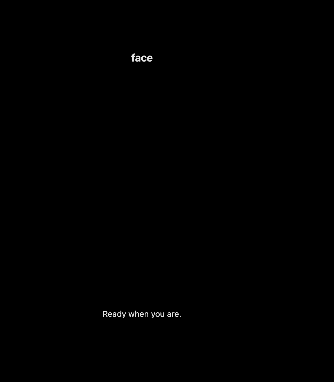
Source: components/flow/Idle.svelte
/*
 * Idle — welcome step before the camera flow starts.
 * Scope rules with .flow-idle so they never leak to other screens.
 */

/* .flow-idle — root: fills height, centers the copy block, inherits default text color */
/* .flow-idle .title — preset label (e.g. face / hand from config) */
/* .flow-idle .subtitle — secondary line (default: “Ready when you are.”) */
Face placement — initial (guiding)

Source: components/ui/FacePlacement.svelte · frame SVG: assets/svg/DisconnectedPlacementBox.svelte
/*
 * Face placement — guides the user into the capture box.
 * Parent screen uses .flow-guidance; these nodes sit above the video layer.
 */

/* .placement-measurer — full-viewport flex measurer; ResizeObserver anchor for overlay size */
/* .face-placement — column: sized frame + caption; width/height set inline from layout math */
/* .face-placement .frame-container — flex cell that centers the SVG frame */
/* .face-placement .frame-wrapper — wrapper around the placement SVG (transition target) */
/* .face-placement-text — instruction under the frame (“Place…”, “Move…”, “Perfect!…”) */

/* --- DisconnectedPlacementBox (SVG) — hooks under .camera-frame --- */

/* .camera-frame — SVG root; set color for stroke / currentColor */
/* .camera-frame .corners — group of L-shaped corner bracket paths */
/* .camera-frame .corners.corners-hidden — hide brackets once a face is detected */
/* .camera-frame .stroke — stroke paths for corners and full rounded rectangle */
/* .camera-frame .full-frame — full rounded-rect outline path */
/* .camera-frame .full-frame.frame-visible — show continuous frame when face is detected */
Face placement — success (guiding)
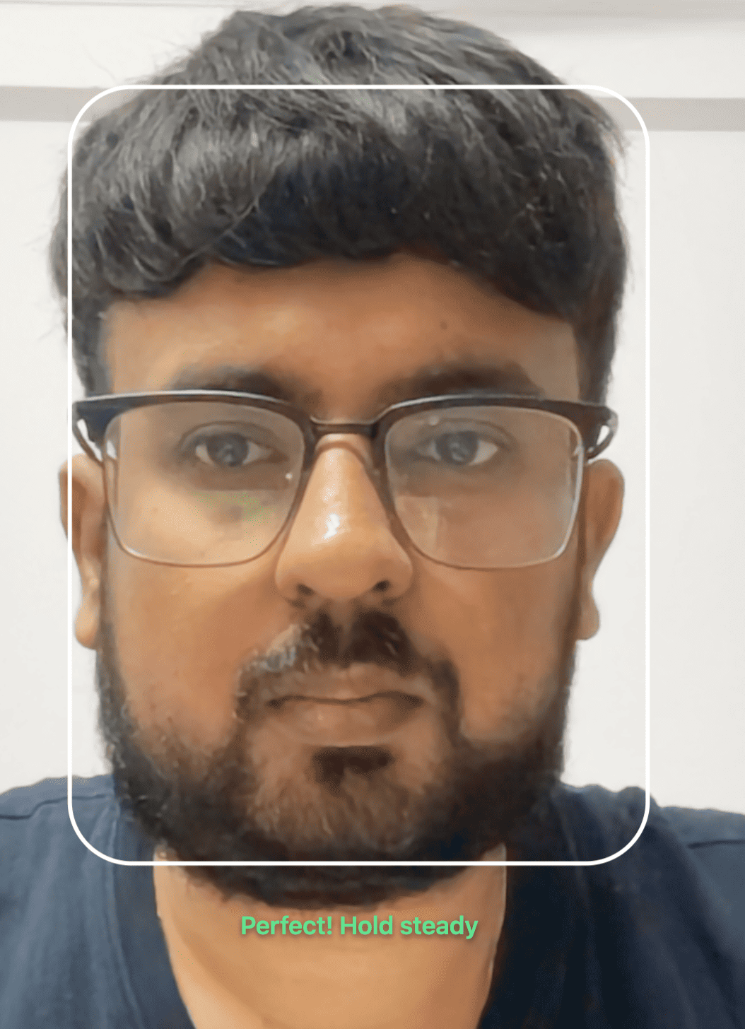
Same DOM as Face placement — initial; extra state modifiers when the face is aligned and inside the box:
/* .face-placement-text.detected — caption in “perfect” state (green, bolder) */
/* .camera-frame .full-frame.frame-visible — continuous rounded frame visible on the SVG */
Lighting indication (guiding)
All three shots below use LightingIndication.svelte. Always scope with .flow-guidance so .bottom-gradient, .container, and .message do not collide with the same class names on Ready to capture or Review.
Screenshot — optimal / perfect

Screenshot — checking / analysing
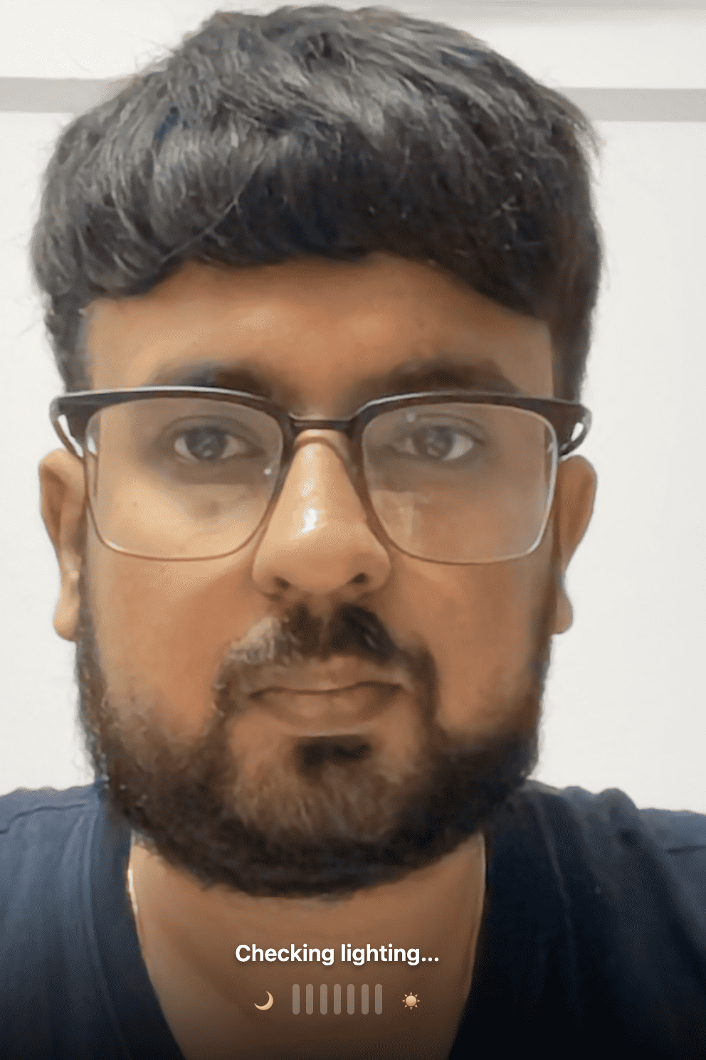
Screenshot — low light / warn
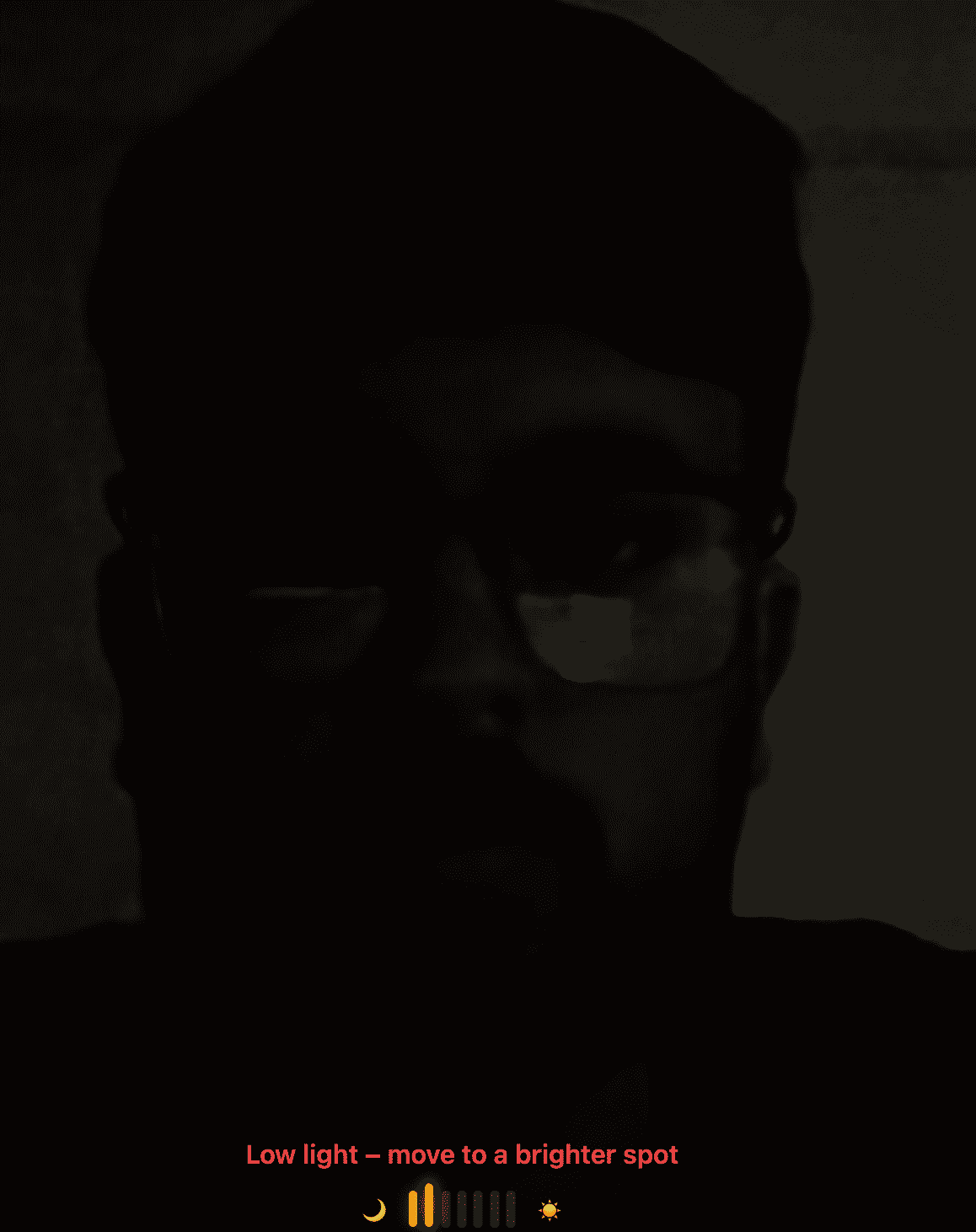
Source: components/ui/LightingIndication.svelte
/*
 * Lighting meter + copy at the bottom of guidance.
 * Prefer .flow-guidance … prefixes on every rule.
 */

/* .flow-guidance .bottom-gradient — dark vertical scrim behind the meter (readability over video) */
/* .flow-guidance .container — column above bottom safe area; stacks message + meter */
/* .flow-guidance .message — status line; copy and inline color follow ML / analysing state */
/* .flow-guidance .meter — flex row: moon + bars + sun */
/* .flow-guidance .bar — one vertical level bar */
/* .flow-guidance .bar.active — bar is inside the “filled” count for current light level */
/* .flow-guidance .bar.perfect — “perfect lighting” fill (green) */
/* .flow-guidance .bar.warn — non-perfect result (e.g. low / too bright) fill */
/* .flow-guidance .bar.lastActive — subtle emphasis on the last lit bar */
/* .flow-guidance .bar.analyzing — pulse animation while ML is running or re-checking */
/* .flow-guidance .icon — shared base for moon and sun emoji icons */
/* .flow-guidance .left-icon — moon side (low end of scale) */
/* .flow-guidance .right-icon — sun side (bright end of scale) */
Distance guide (guiding)

Source: components/ui/DistanceGuide.svelte
/*
 * Distance step — oval “portal” with dimmed surroundings.
 * Message switches between too close / too far / hold steady; color may be inline.
 */

/* .overlay — full-screen overlay root; ResizeObserver measures for frame size */
/* .overlay .frame-wrapper — centers the oval; width/height from face-distance math */
/* .overlay .backdrop — oval hole via box-shadow (dim outside the ellipse) */
/* .overlay .frame — white elliptical ring */
/* .overlay .bottom-gradient — bottom fade for legibility over video */
/* .overlay .message — centered line: too close / too far / hold steady */
Head pose guidance (guiding)
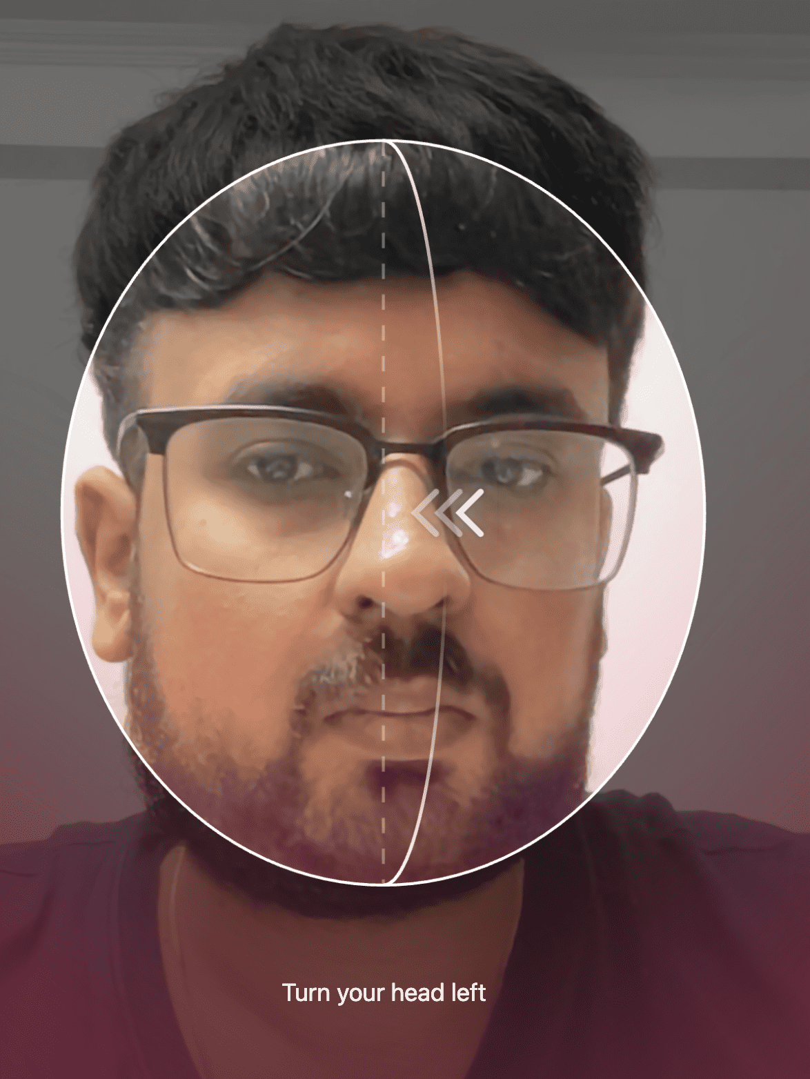
Source: components/ui/HeadPoseGuidance.svelte
/*
 * Head pose — oval mask, dashed axis, arc guide, chevrons, bottom copy.
 * Prefer hooks below; inner nodes may use utilities or svelte-* — treat those as unstable.
 */

/* .head-pose-measurer — full-stage measurer; sets --hp-scale, --hp-face-box-width */
/* .head-pose-measurer .full-screen — flex column centering the face-box stack */
/* .head-pose-measurer .status-backlight — optional bottom “backlight” / mask art layer */
/* .head-pose-measurer .face-box — sized box matching the tracked face region */
/* .head-pose-measurer .head-pose-vignette-wrap — vignette wrapper outside the oval */
/* .head-pose-measurer .head-pose-vignette-slot — scaled slot for vignette inner */
/* .head-pose-measurer .head-pose-vignette-inner — inner canvas scaled to viewport */
/* .head-pose-measurer .head-pose-scale-clip — clip region for the guide stack */
/* .head-pose-measurer .head-pose-scale-slot — scaled slot for guides */
/* .head-pose-measurer .head-pose-scale-inner — inner design canvas (scaled) */
/* .head-pose-measurer .head-pose-oval-slot — sets currentColor for SVG strokes */
/* .head-pose-measurer .head-pose-oval-guides-svg — oval ring + dashed axis + pose arc */
/* .head-pose-measurer .head-pose-guide-arc — curved target path for head rotation / tilt */
/* .head-pose-measurer .angle-deviation-guide — layer that hosts chevron positioning */
/* .head-pose-measurer .direction-indicator-container — positions the chevron cluster */
/* .head-pose-measurer .head-pose-chevron-svg — three-chevron direction SVG */
/* .head-pose-measurer .help — bottom strip: guidance text + indicator row */
/* .head-pose-measurer .guidance — visible guidance message wrapper */
/* .head-pose-measurer .indicator — reserved bottom row under guidance */
Ready to capture — countdown (readyToCapture)
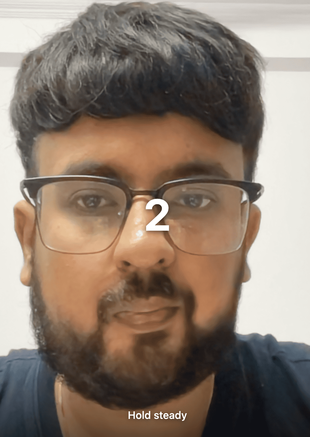
Source: components/flow/ReadyToCapture.svelte
/*
 * Countdown over live video before shutter fires.
 * Use .flow-ready prefix — .bottom-gradient and .message also exist on other screens.
 */

/* .flow-ready — screen root; full-size layer over the stage */
/* .flow-ready .countdown-container — flex box that centers the large digit */
/* .flow-ready .countdown-number — numeric countdown (3 → 2 → 1) */
/* .flow-ready .bottom-gradient — bottom scrim for legibility */
/* .flow-ready .message — line under the digit (default: “Hold steady”) */
Review (review)
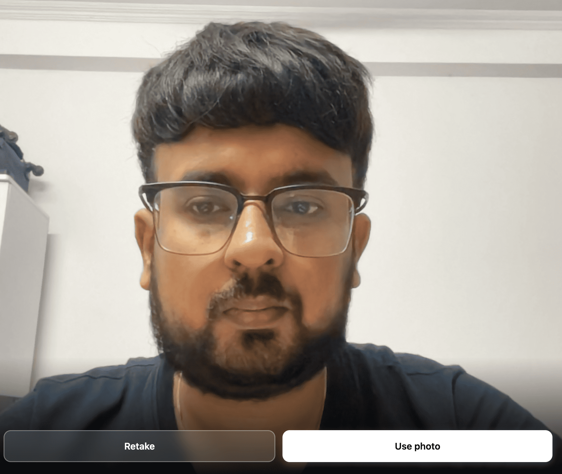
Source: components/flow/Review.svelte · loader overlay: components/ui/CaptureIqLoader.svelte
/*
 * Review — full-bleed preview, optional quality panel, bottom actions.
 */

/* .flow-review — root; black letterbox behind the preview */
/* .flow-review .image-container — absolute region that letterboxes the captured <img> */
/* .flow-review .captured-image — the still; object-fit cover */
/* .flow-review .captureiq-loader — full-screen overlay while URL missing or quality assessing */
/* .flow-review .captureiq-loader .backdrop — dim + blur behind loader copy */
/* .flow-review .captureiq-loader .inner — spinner + text column */
/* .flow-review .captureiq-loader .spinner — animated ring */
/* .flow-review .captureiq-loader .msg — primary loader line (“Preparing preview…”, etc.) */
/* .flow-review .captureiq-loader .detail — optional secondary loader line */
/* .flow-review .quality-panel — glass panel when automated quality failed */
/* .flow-review .quality-title — panel heading */
/* .flow-review .quality-score — numeric score line */
/* .flow-review .quality-list — bullet list of problem labels */
/* .flow-review .quality-hint — short hint (“Try Retake…”) */
/* .flow-review .bottom-gradient — bottom scrim so buttons read on bright images */
/* .flow-review .actions — flex row for Retake + Use photo */
/* .flow-review .btn — shared padding, radius, flex alignment for both buttons */
/* .flow-review .btn.primary — solid “Use photo” CTA */
/* .flow-review .btn.primary.disabled — disabled look when quality failed or assessing */
/* .flow-review .btn.secondary — outline / glass “Retake” */
/* .flow-review .btn-icon — optional icon slot inside a button (styled; may be unused in markup) */
Recommended vs fragile
Prefer
- Flow roots:
.captureiq-root,.flow-idle,.flow-guidance,.flow-ready,.flow-review, … - Named blocks:
.face-placement,.meter,.quality-panel,.head-pose-measurer :host { --captureiq-… }for global theming
Avoid
svelte-*hashed classes and copy-pasted utility strings from markup unless you accept breakage on upgrades- Bare
.bottom-gradientor.messagewithout a flow parent
Invalid or blocked CSS (CSP, bad @import) may be silently ignored in part. Inspect Shadow root on <glamar-captureiq> in DevTools and look for <style data-captureiq="host-styles">.
Related
- Configuration —
config,styles, CSP notes - Setup — load script and mount element
- Events — lifecycle and capture events